
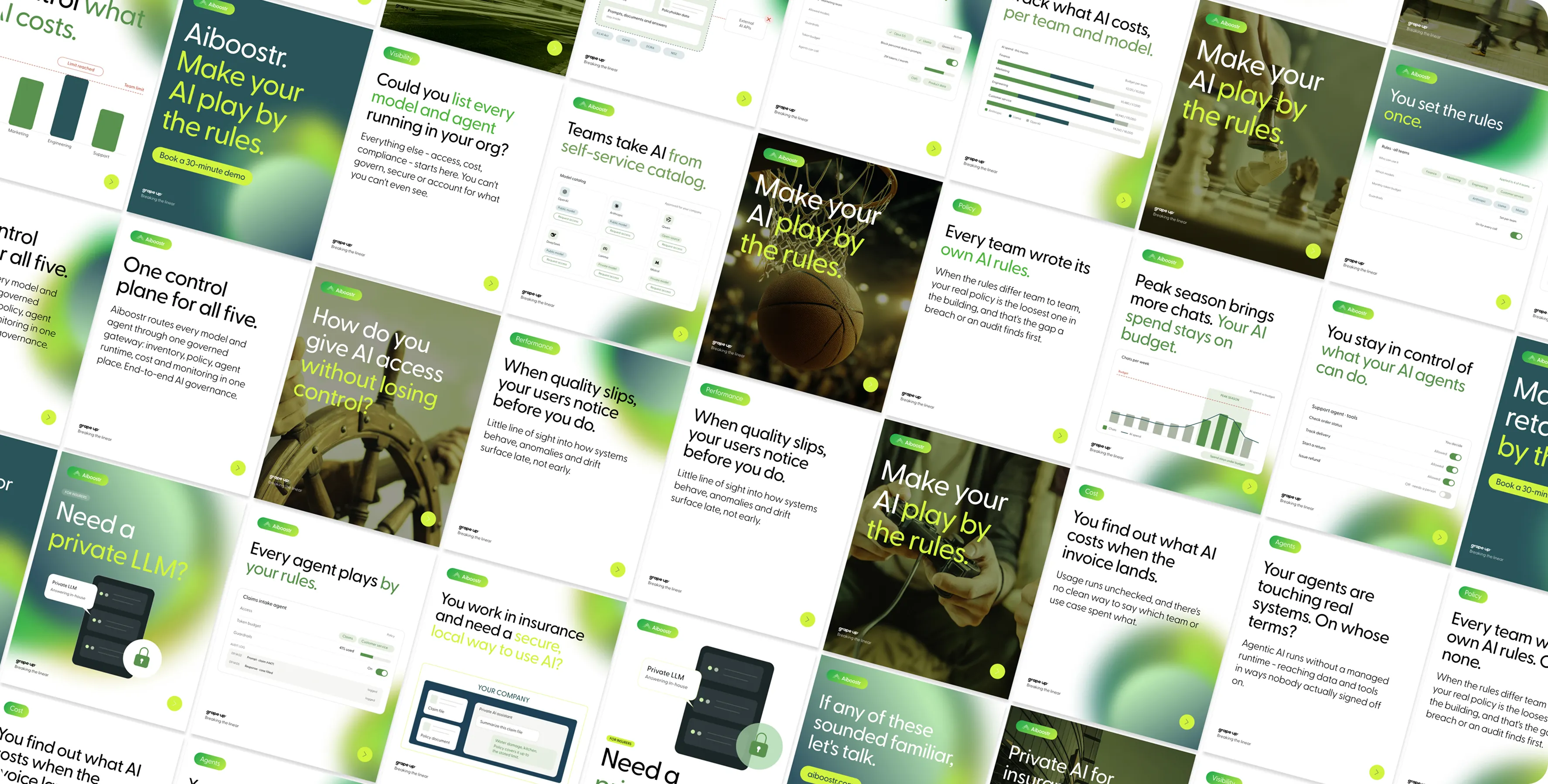
Grape Up builds cloud and AI solutions for enterprise clients. Its products share one name and one logic: Cloudboostr, Databoostr, and now Aiboostr, a platform that gives companies one place to orchestrate and govern every AI model and agent they use.
Aiboostr arrived as companies were adopting AI faster than they could keep track of it, and in a year when European businesses started asking where their AI runs and who controls it. The platform works in layers. One gateway for every model and agent. Private models that stay inside the company's own infrastructure. And built-in logging and guardrails that address EU AI Act requirements.
The launch had a date and a place: AGNTCon + MCPCon Europe in Amsterdam, in September 2026. Afterwards, the same brand would live on grapeup.com and in Grape Up's social channels, next to Cloudboostr and Databoostr.
My scope of work included the brand identity (mark, palette and key visual), the event kit (booth wall, flag, leaflets and stickers), social media and ad assets with a set of reusable Figma layouts, a four-page section of grapeup.com designed and built in Webflow, and UI styling guidelines for the product itself.


A product brand has to do two things that pull in opposite directions: be noticed on its own, and belong to the family it came from.
Two roles, one brand. At an international tech conference, Aiboostr had to win attention among dozens of booths competing for the same few seconds. On grapeup.com and in social media, it had to speak the same visual language as Cloudboostr, Databoostr and the Grape Up brand.
A date that couldn't move. The brand, the event kit and the website all had to be ready for AGNTCon + MCPCon Europe in September 2026. The conference set the deadline, and every decision had to fit inside it.
A product that didn't look like the brand. Aiboostr already existed as a working beta, built by Grape Up's developers. It worked, but it didn't yet look like a Grape Up product.
One image, two media. The key visual had to hold up on a phone screen and on a large printed booth wall, without losing the softness that made it work.
The project began with the marketing brief, a conversation with the product team and a look at the competition. What could make Aiboostr different, and how could it still belong?
Mark and colour
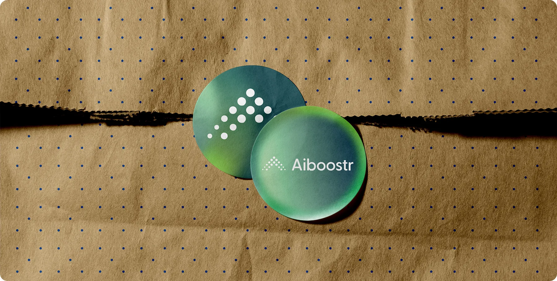
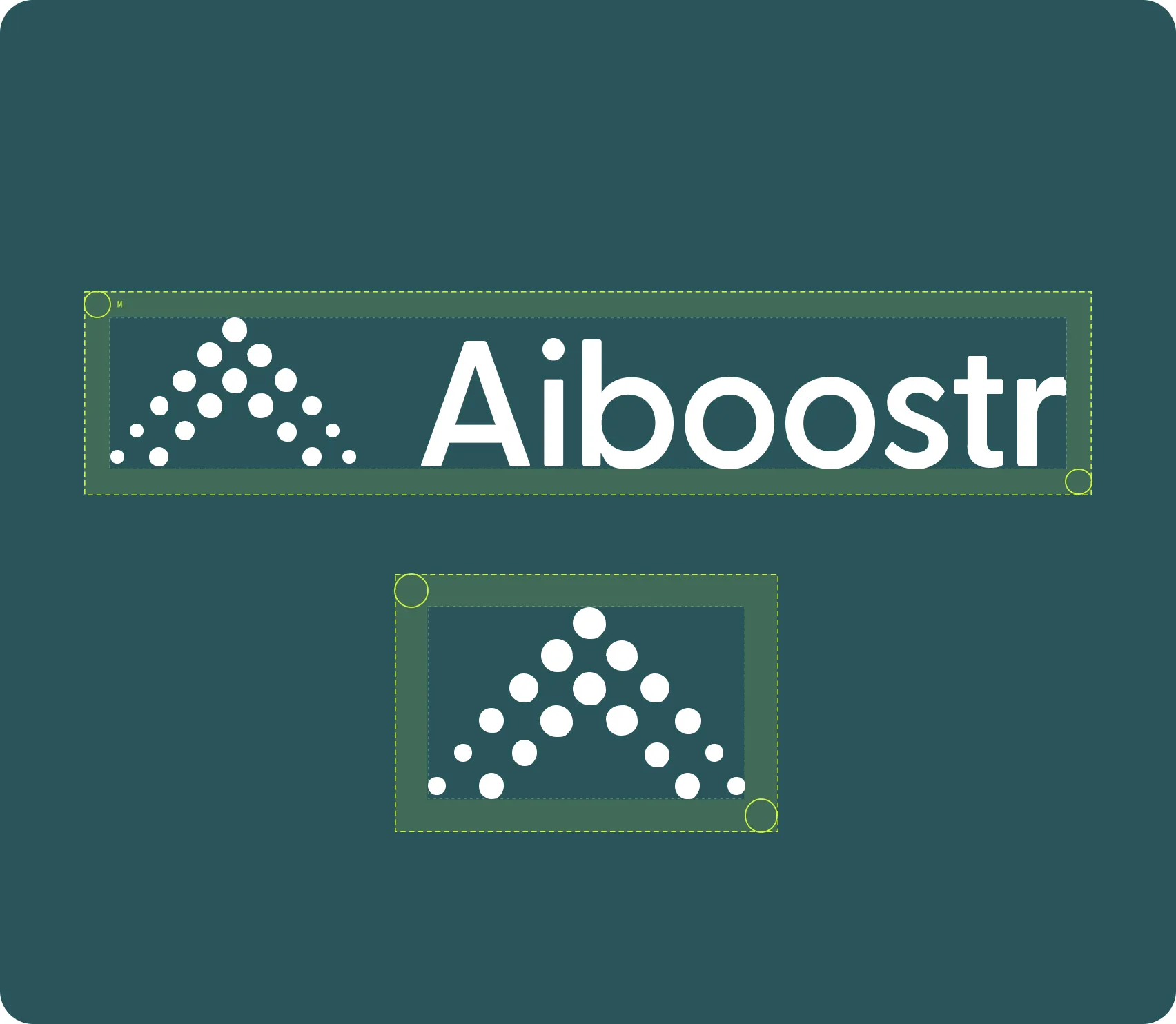
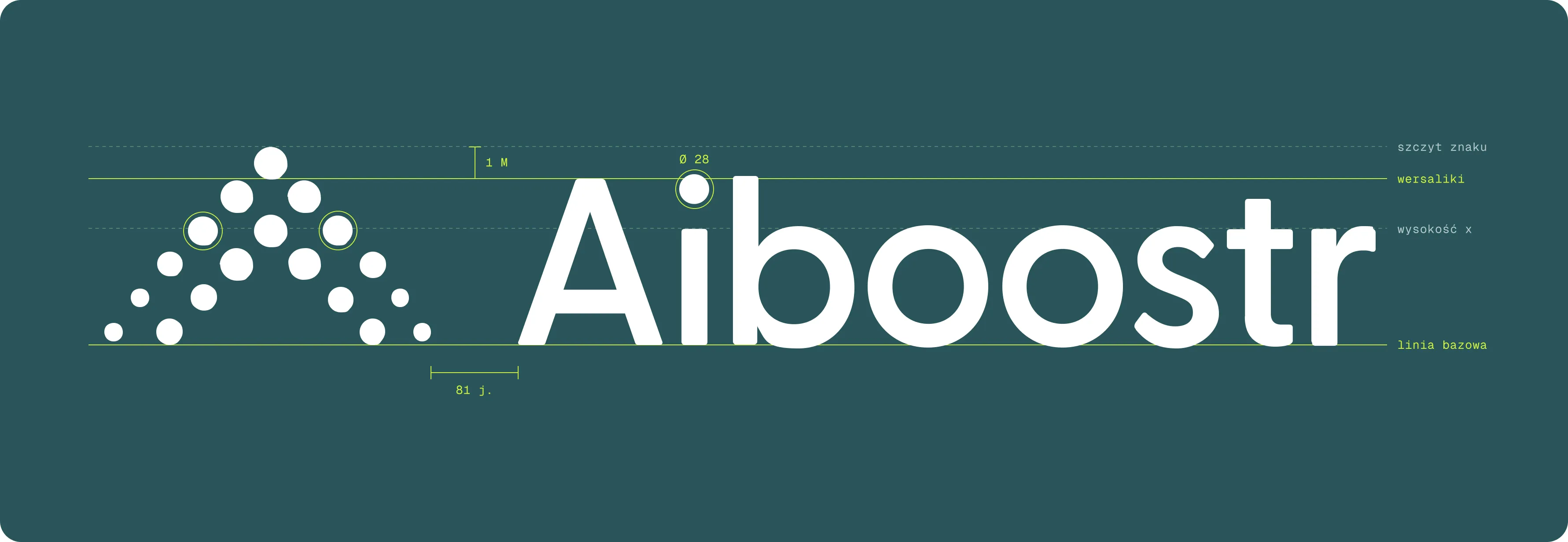
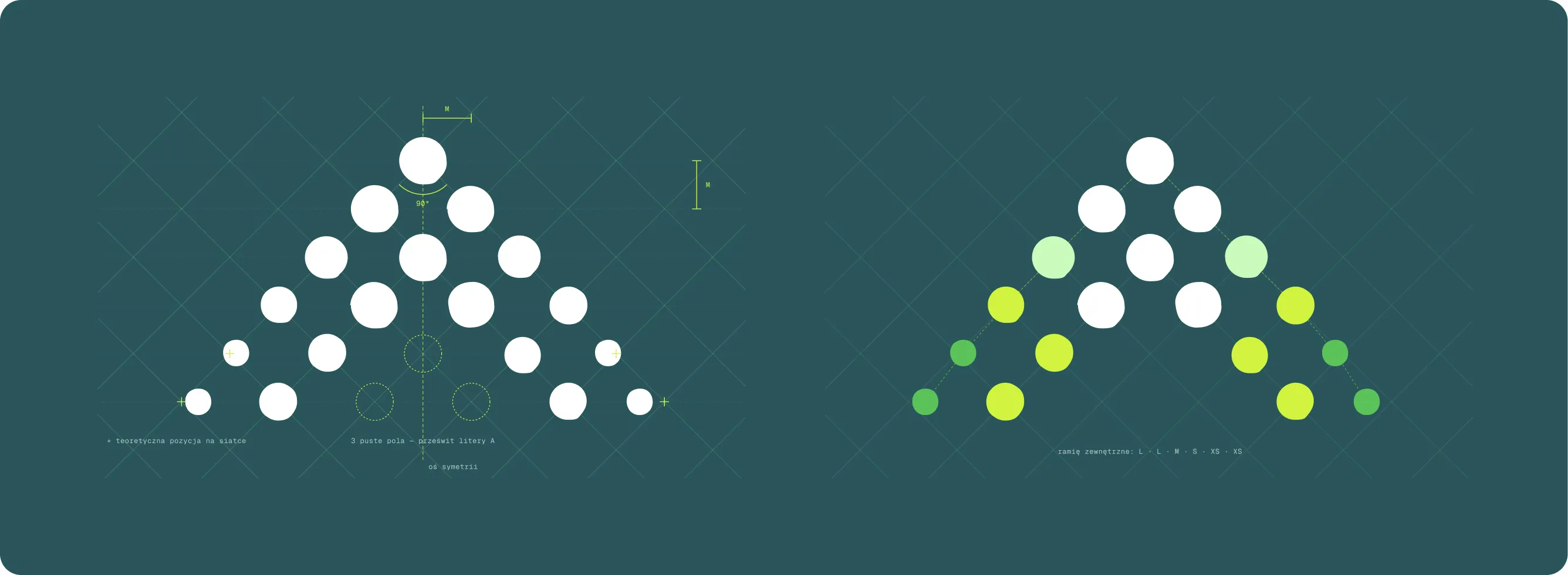
The answer lay in a system I had already designed for Grape Up's products. Each carries “boostr” in its name, each is marked by a sign made of dots, and each owns one gradient. In every mark of the family, the dots stand for data and its boost. In Aiboostr they gather into a triangle that reads as both an A and an arrow pointing forward: AI, accelerated.
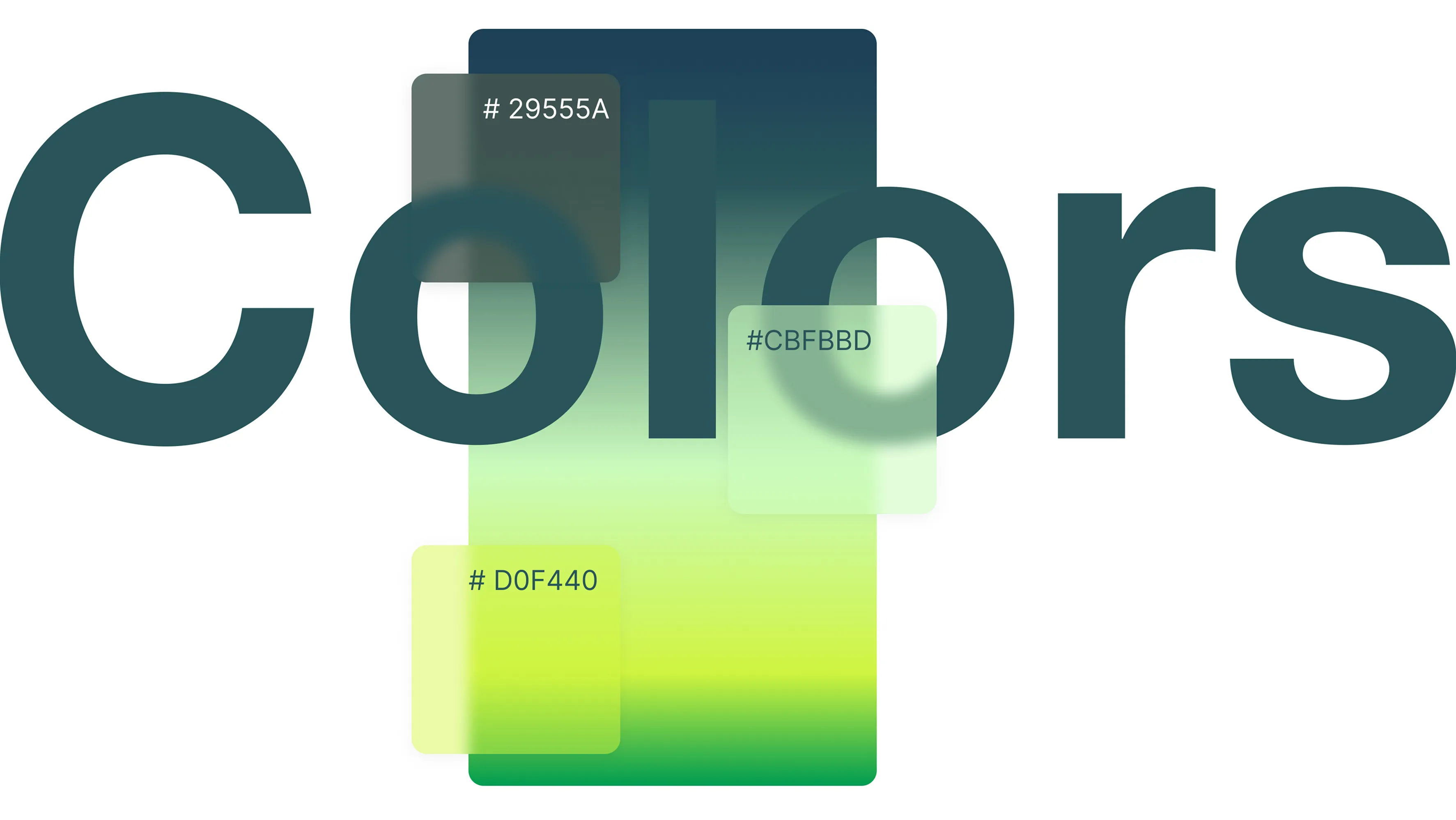
The family already had blue for Databoostr, and pink and violet for Cloudboostr. Aiboostr's green and lime set it apart while keeping it unmistakably part of the family.
The palette carries the brand's two volumes. On the conference floor and in the product, deep teals form the background, with white type and lime accents that cut through a crowded hall. On grapeup.com, Aiboostr follows the parent brand: white space, black type, colour used only as an accent. Same brand, quieter voice.

Key visual
The platform's layers find their symbolic counterpart in the key visual: a single gradient circle, softened by three layers of blur. Green #009C51 and pale mint #CBFBBD build the gradient. Look at it long enough and it starts to read like the platform itself: one form, with depth you can see through, layer by layer.To hold up on a printed booth wall, the image needed AI-assisted upscaling and a colour space conversion in Photoshop, so the softness of the blur survived the move from pixels to print.
At the conference
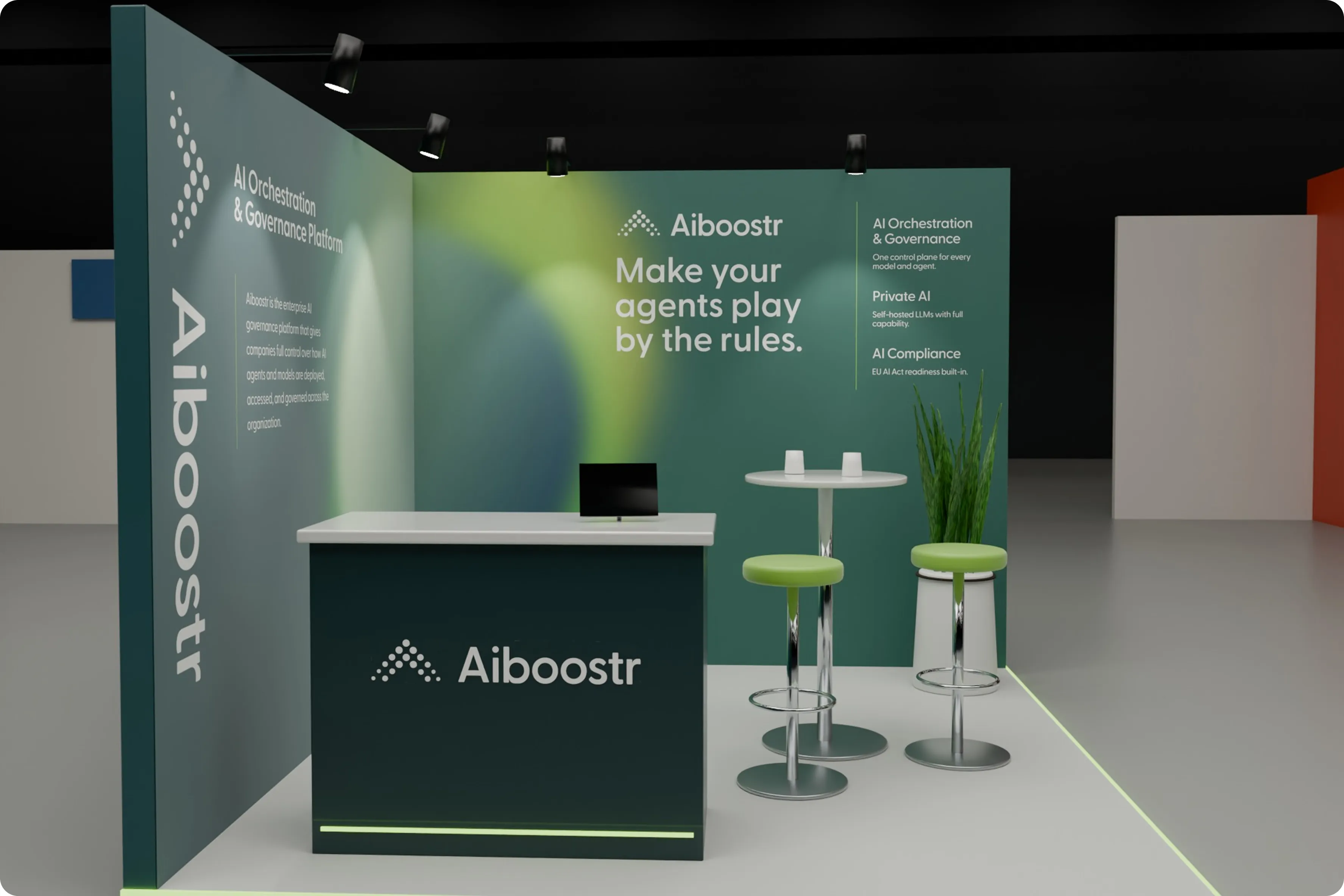
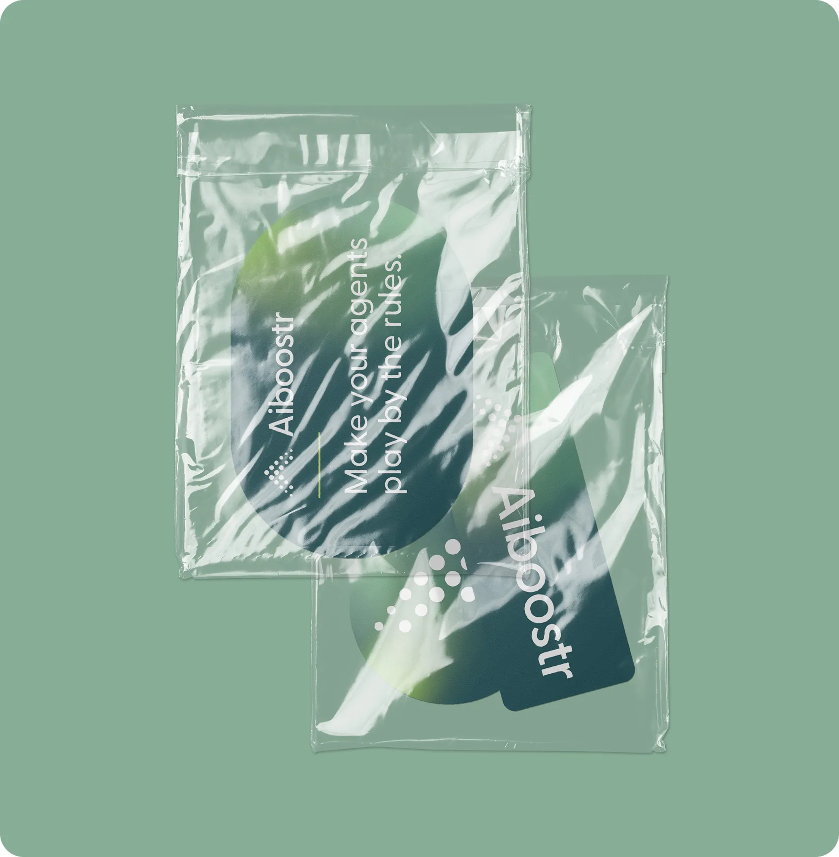
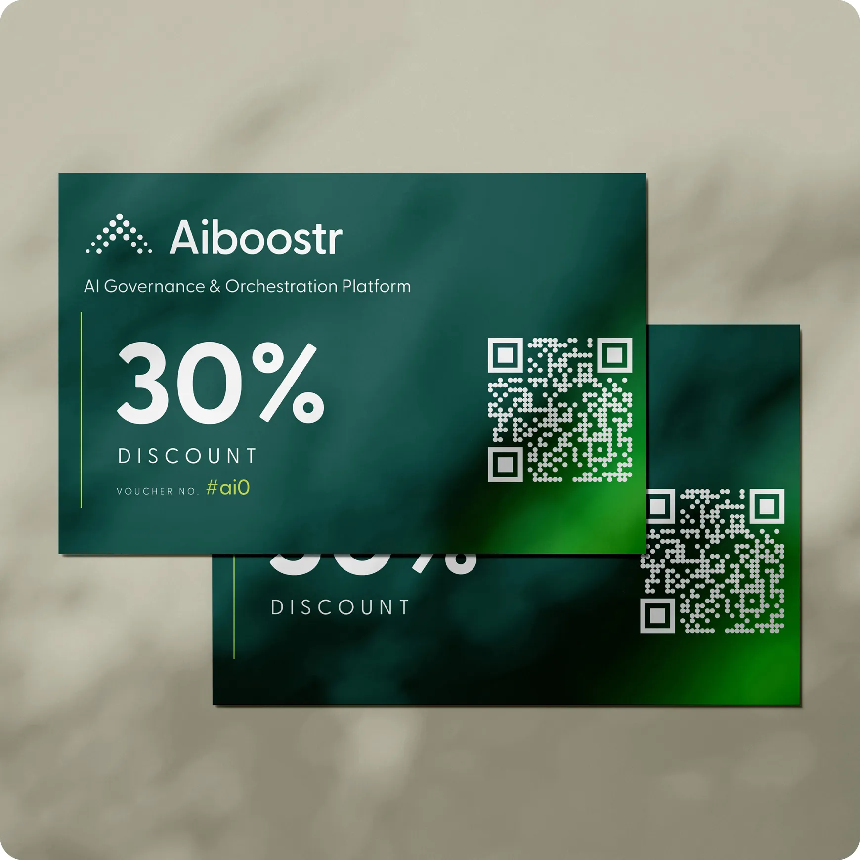
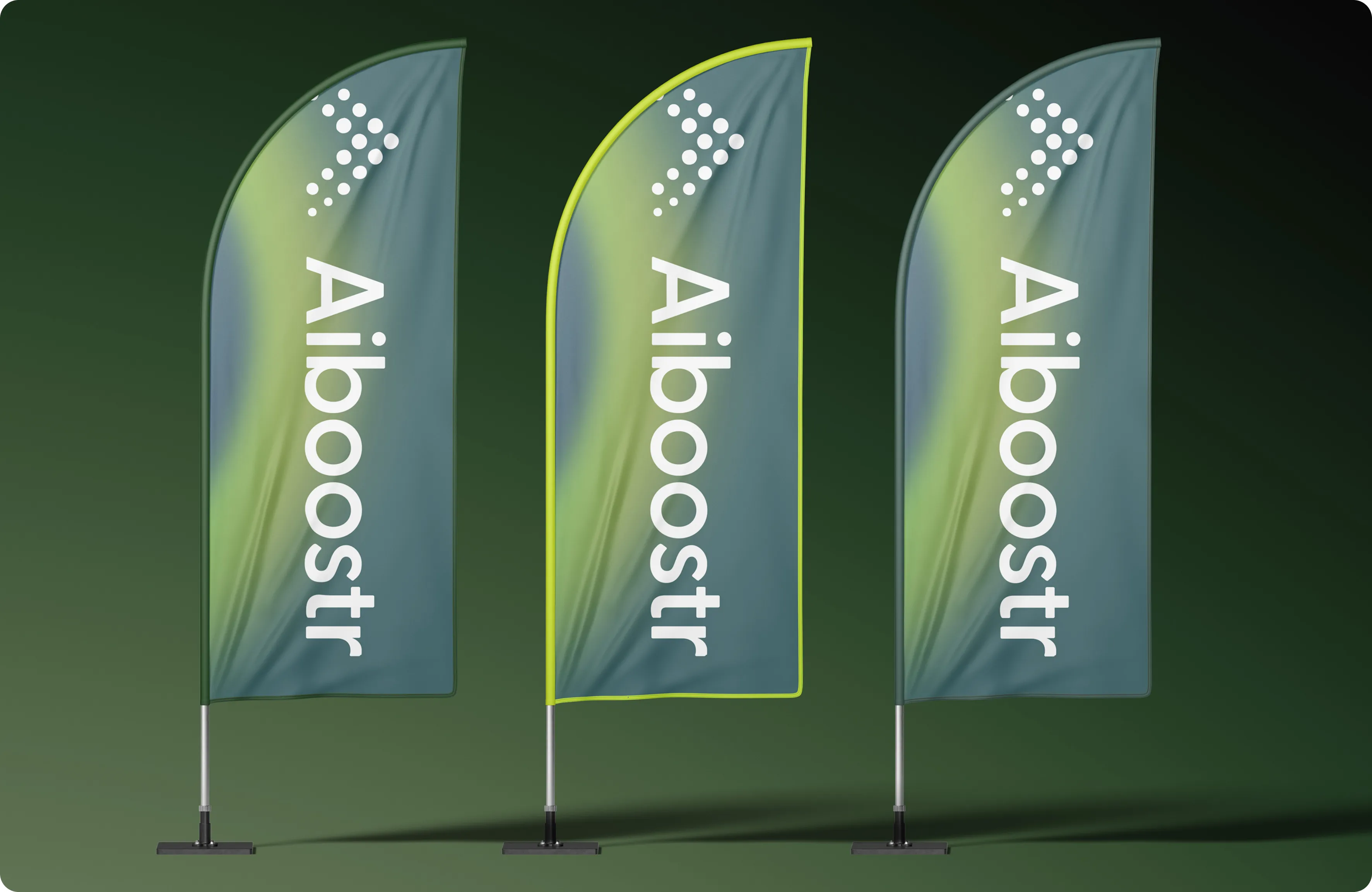
In Amsterdam the identity took the form of a booth wall, a flag, leaflets and stickers. In a hall full of competing stands, colour did most of the work: the green and lime made the booth stand out.

On the web
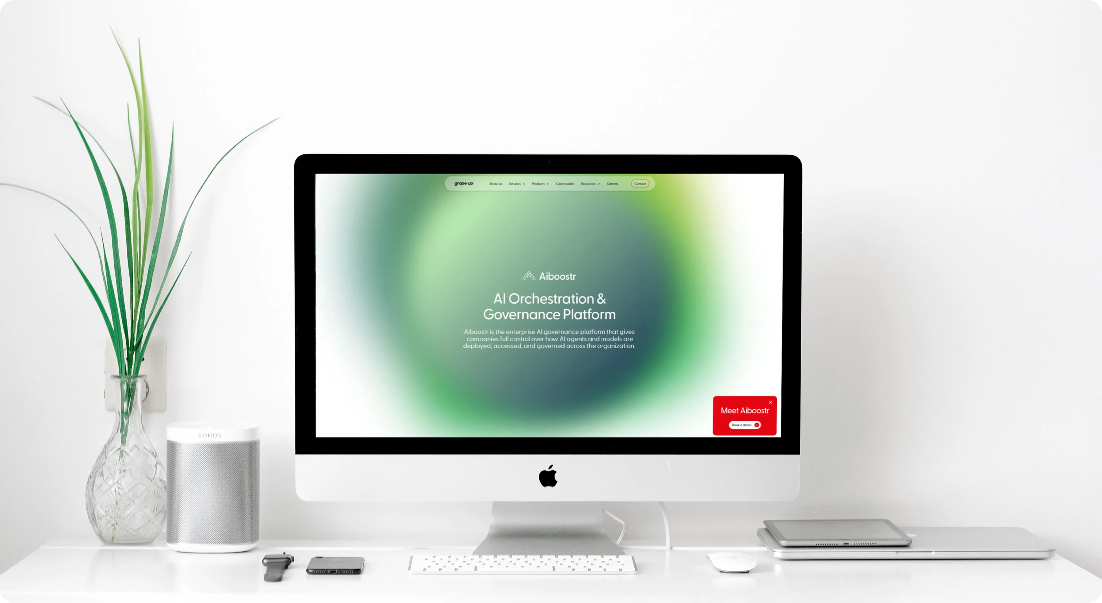
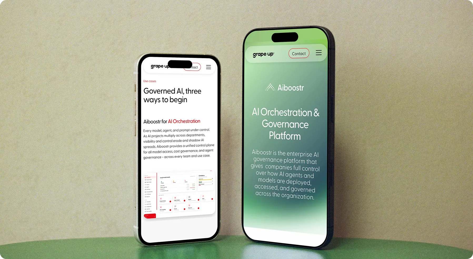
On grapeup.com, Aiboostr lives as part of the company's site rather than as a separate one. Its four pages follow Grape Up's own design language and bring the product palette in only as an accent, so Aiboostr reads as one product in a portfolio.The pages follow a classic lead-generation path. A clear promise opens the page, three benefits name the problems buyers recognise, and a tabbed product tour shows the real screens. Three ways in follow, one for each layer of the platform: orchestration, private AI and the EU AI Act. A “Book a demo” call to action returns at the key moments, and an FAQ answers the questions a buyer would otherwise bring to a sales call.The site is built in Webflow from a system of components, and ad assets and reusable Figma layouts extend the same system into the campaign.
In the product
Instead of redrawing every screen in static mockups, I recreated the beta as a clickable prototype in Claude Design, then reshaped its styling through prompts, guided by a design system built in Figma on Grape Up's brand. From receiving the beta to the final version going into development took under two weeks.
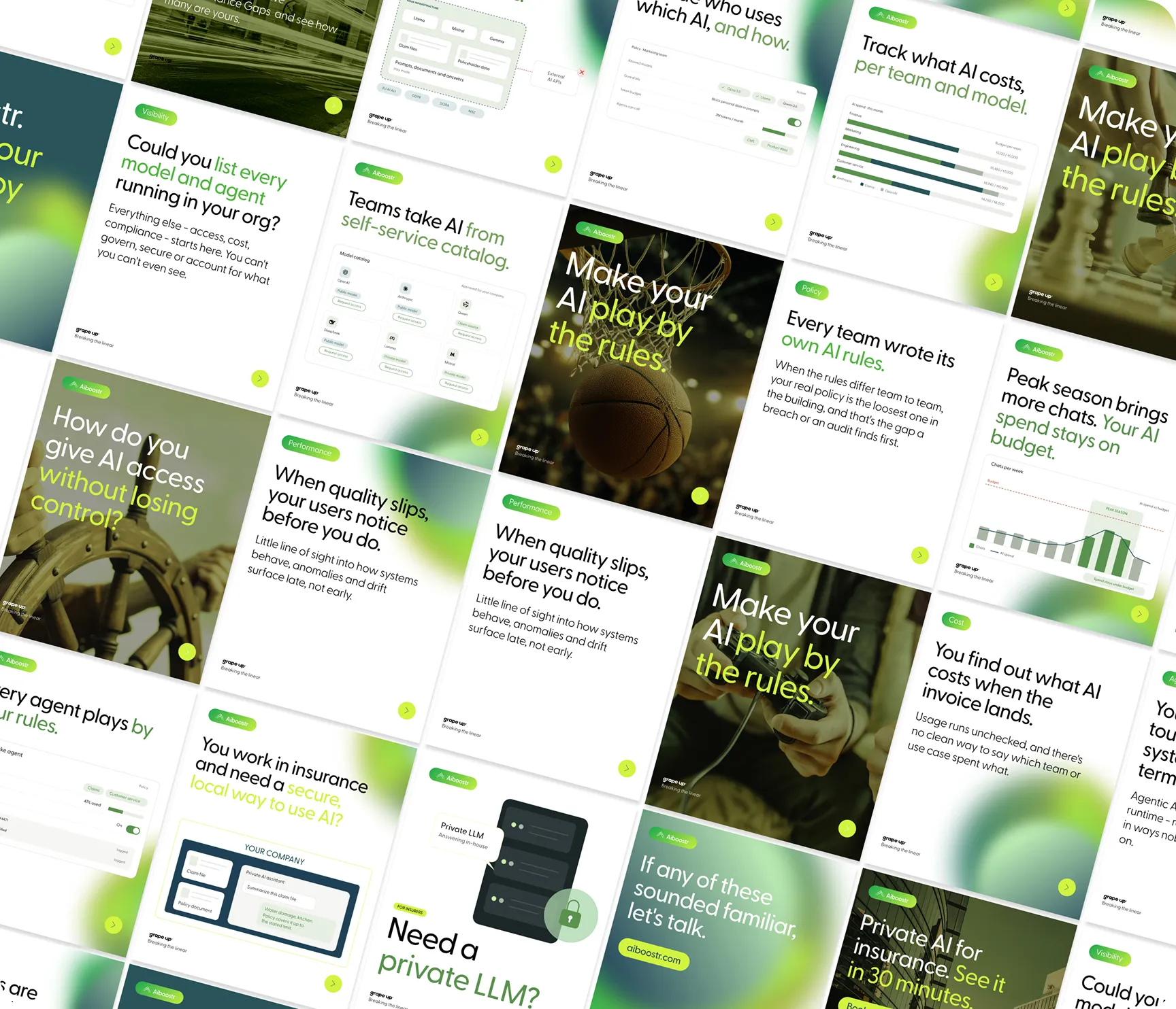
Aiboostr launched on time with one consistent brand, from the booth in Amsterdam to the website and the product itself. Around 30 leads came out of the conference, and every one of them went on to a product demo, shown in an interface restyled in under two weeks. Reusable layouts, a Webflow component system and UI guidelines now let Grape Up's teams keep building on the brand on their own.


