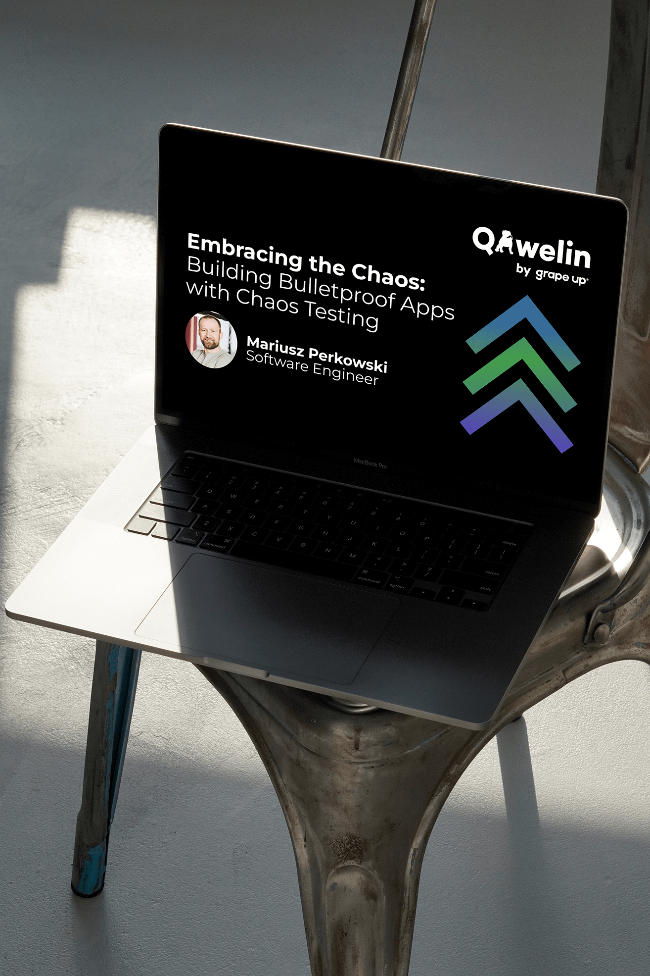
QAwelin is a tech meetup, held in Białystok for nearly two years, the event brings together QA professionals and testing enthusiasts. It required a brand identity that would resonate with a professional, developer, or manager, with a focus on quality. A design team (Olga Wazowska & Joanna Walczy-Antkowicz) - that I led as a lead graphic designer - managed the entire branding process - from collecting the event organizers’ requirements to designing key brand materials.

.jpg)
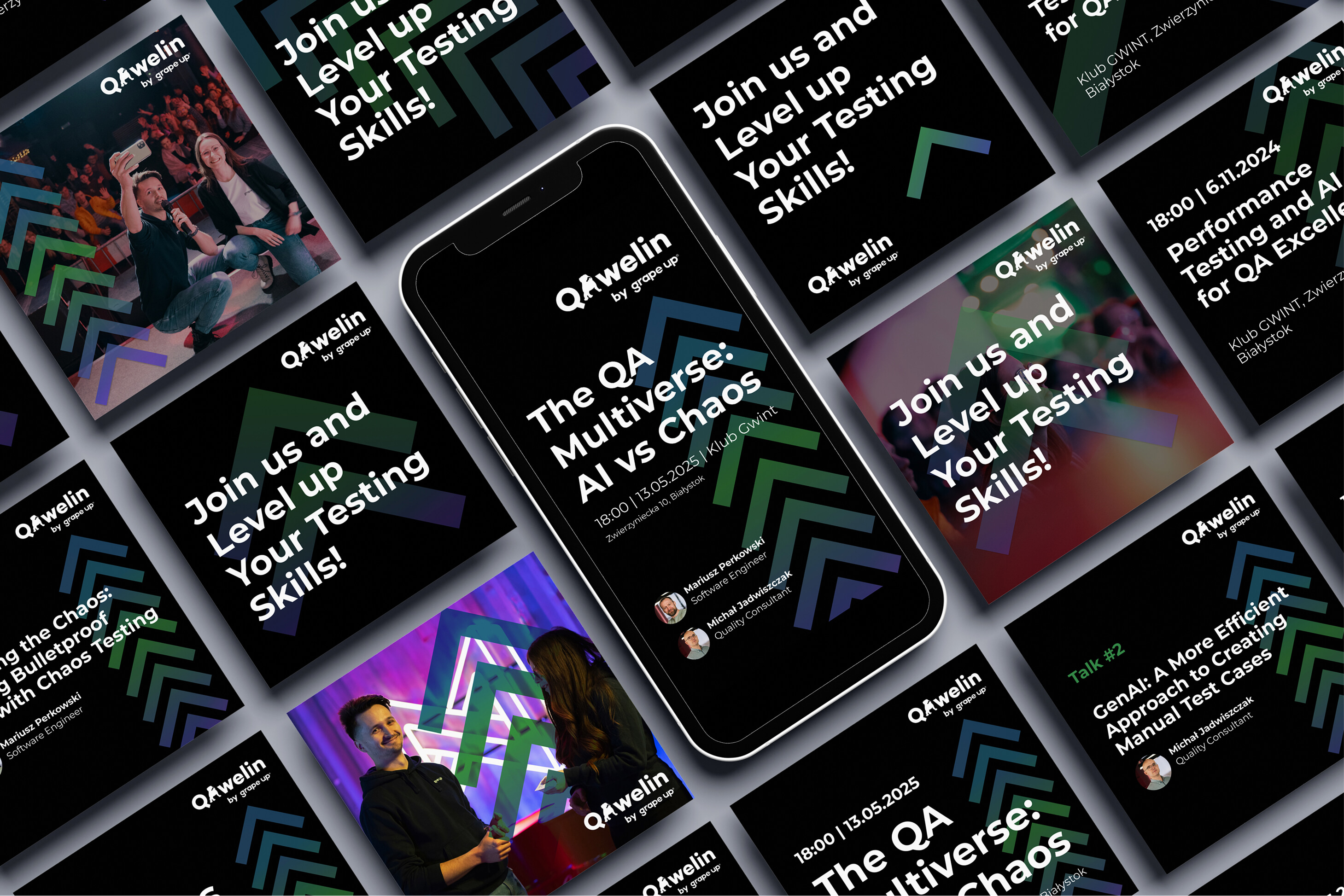
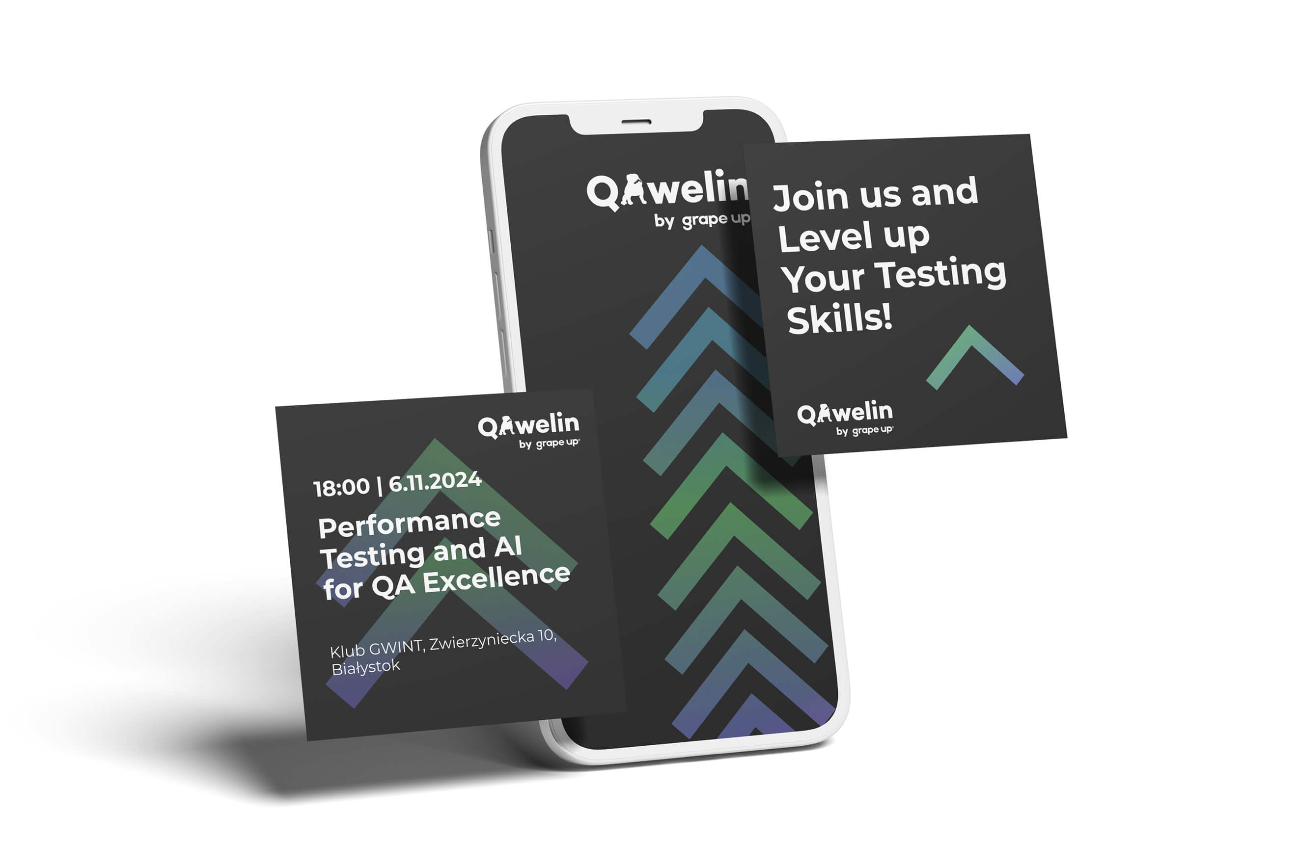
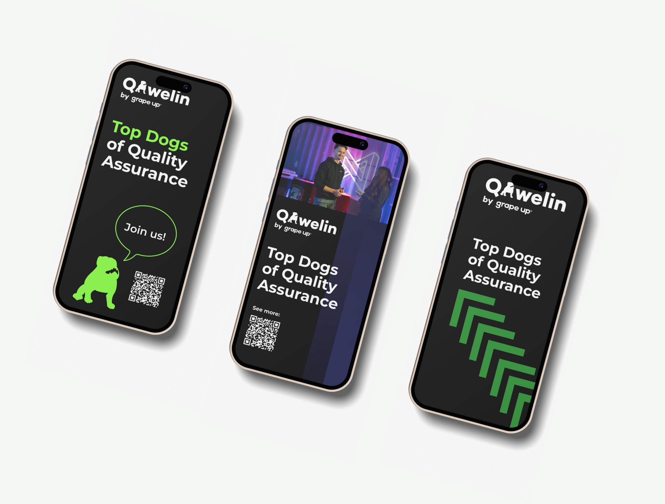
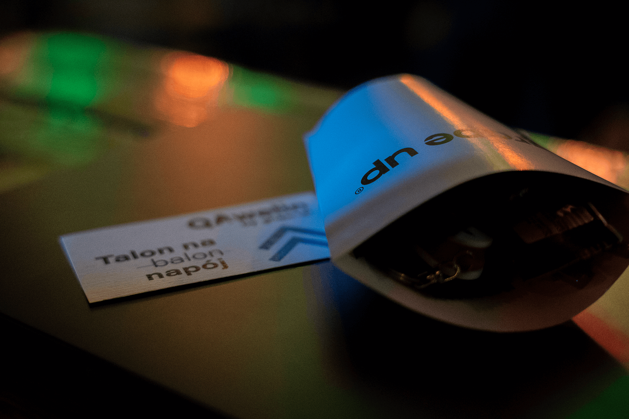
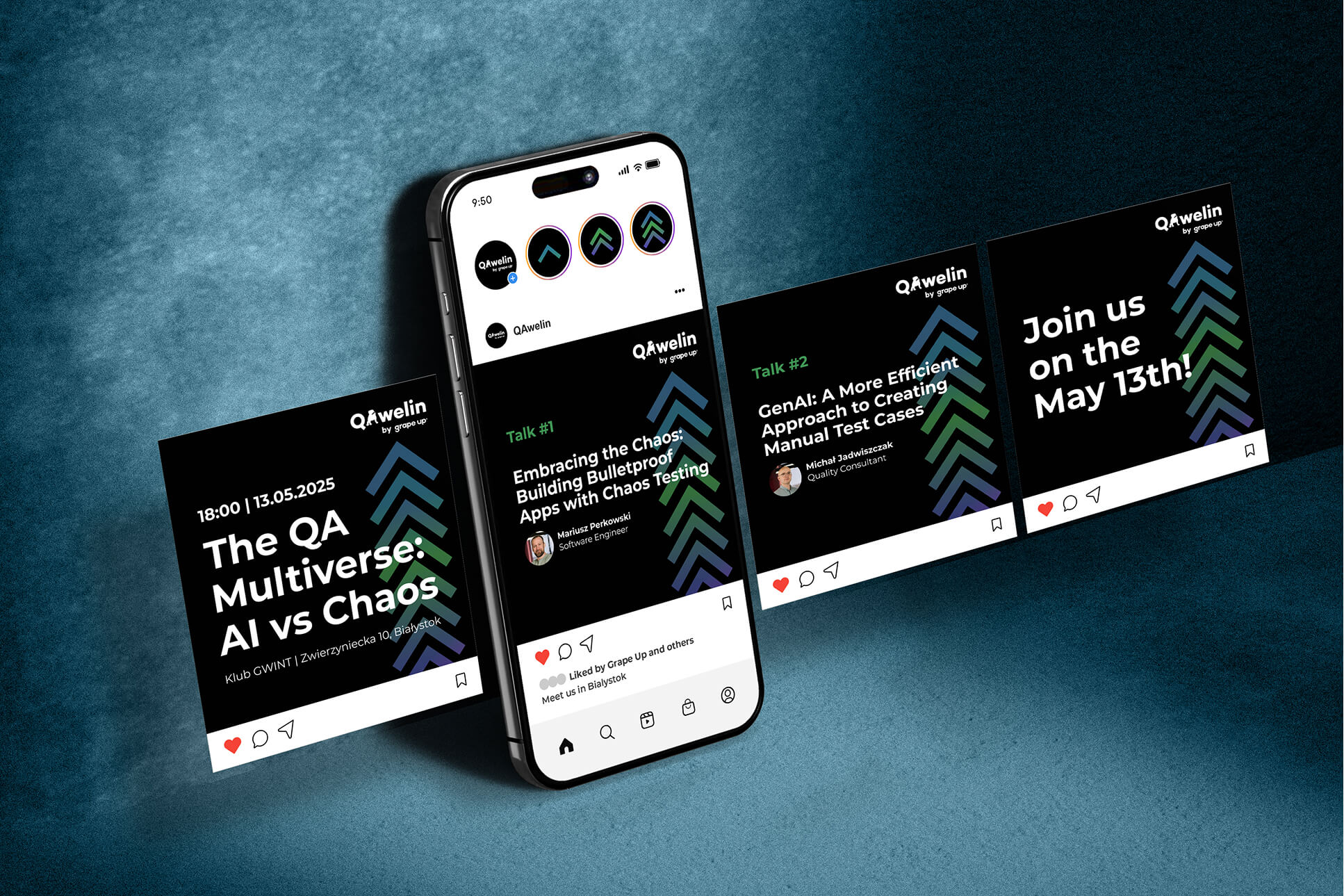
The project included designing a visual identity—logo, branding, and materials for social media, presentations, and print—that captured the meetup’s atmosphere. We started by researching branding strategies for IT events and analyzing how successful tech meetups position themselves, focusing on the specific needs of the target audience. In the conceptual phase, we created three visual directions, from which one was selected and then developed into the final branding.
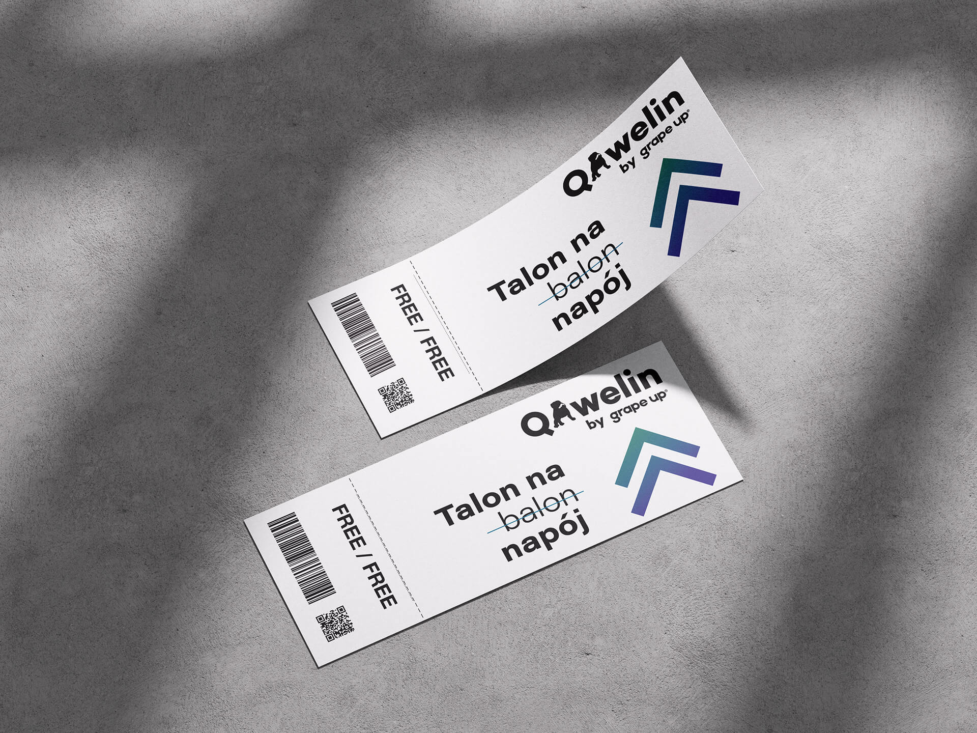
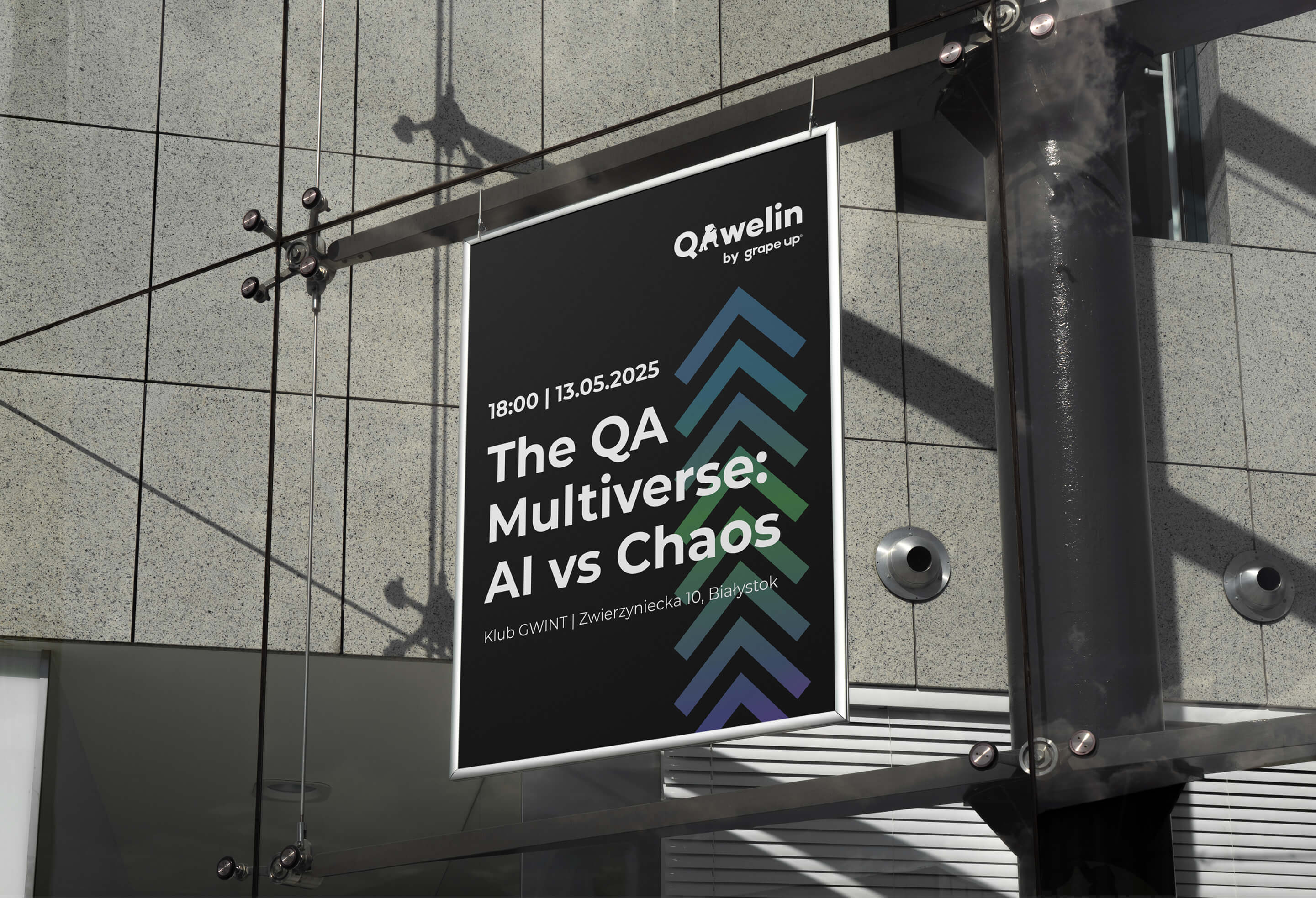
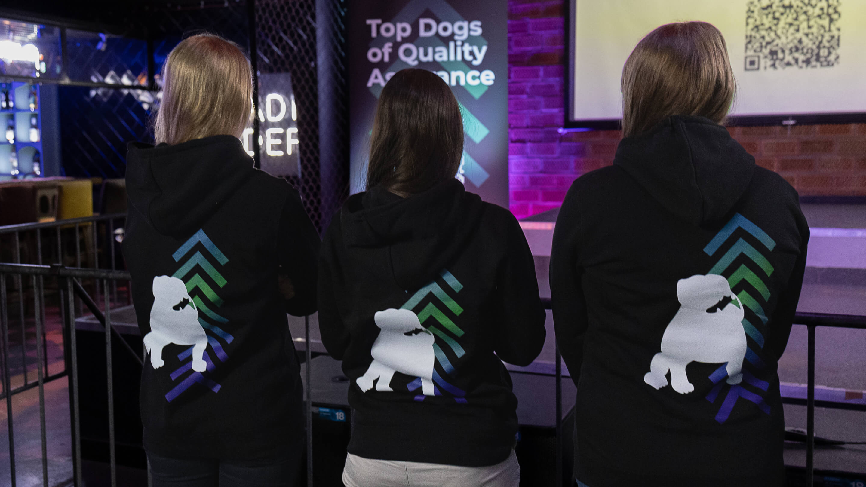
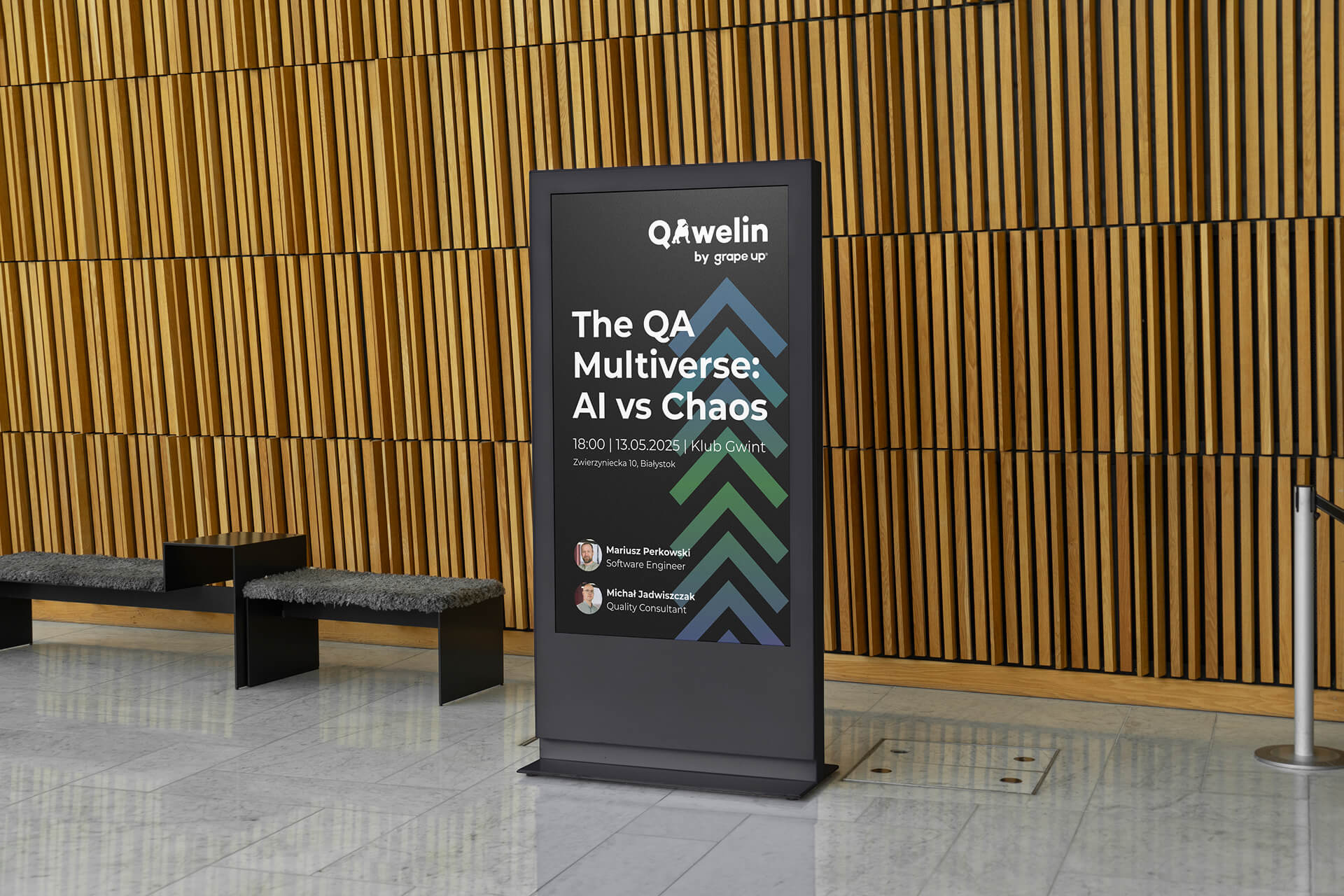
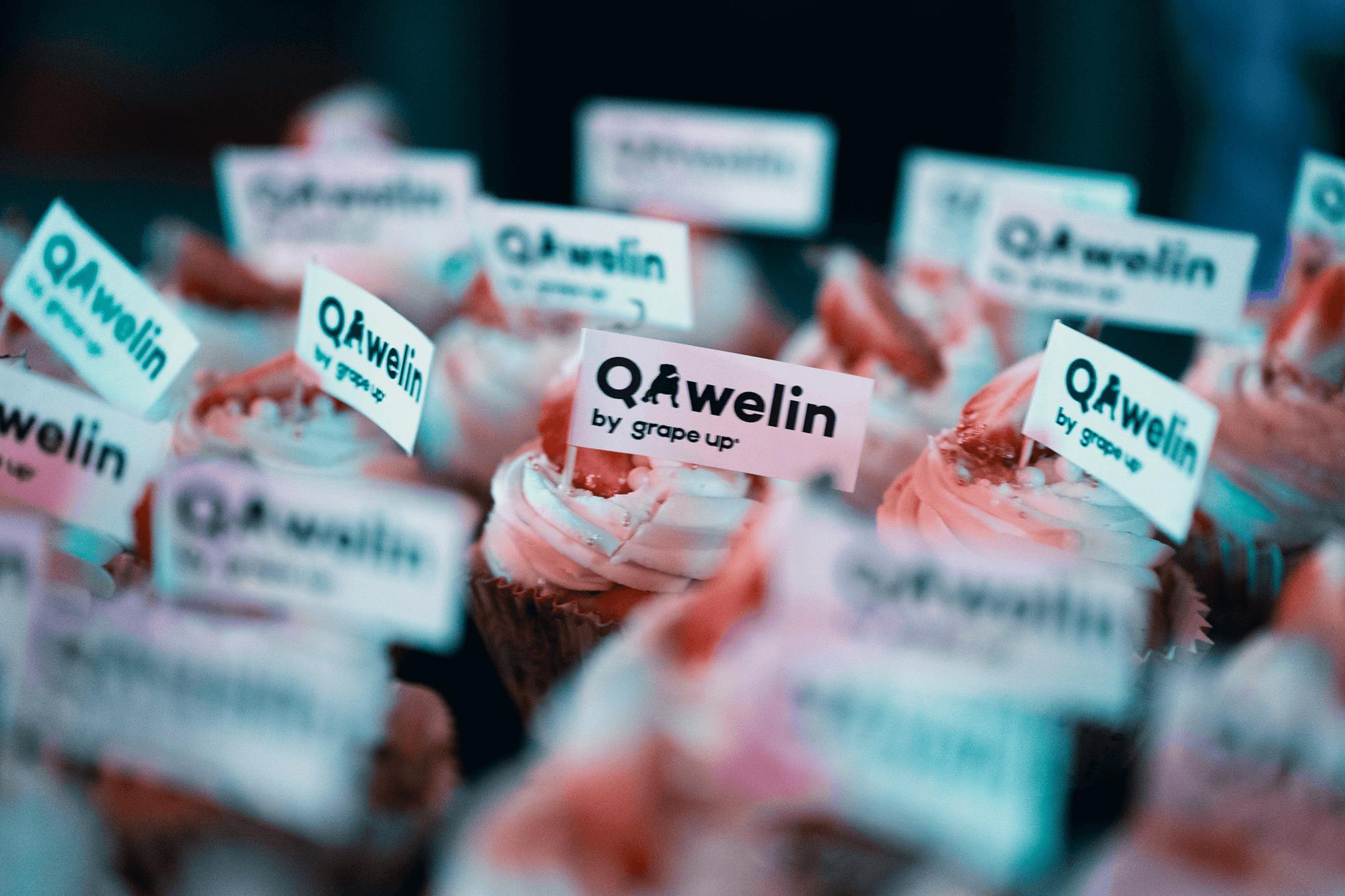
A key element was a graphic symbol inspired by Kawelin’s iconic dog, referencing a well-known Białystok landmark. This reference was intentional: we wanted to anchor QAwelin in a recognizable local context, turning the symbol into a subtle nod to a familiar meeting point that resonates with the local community while emphasizing the event’s spirit of gathering and connection. The color palette combines professional, tech-inspired tones with vibrant accents to reflect the meetup’s dynamic spirit. Typography was selected for clarity and readability, supporting a consistent and modern look across all brand materials.
.jpg)
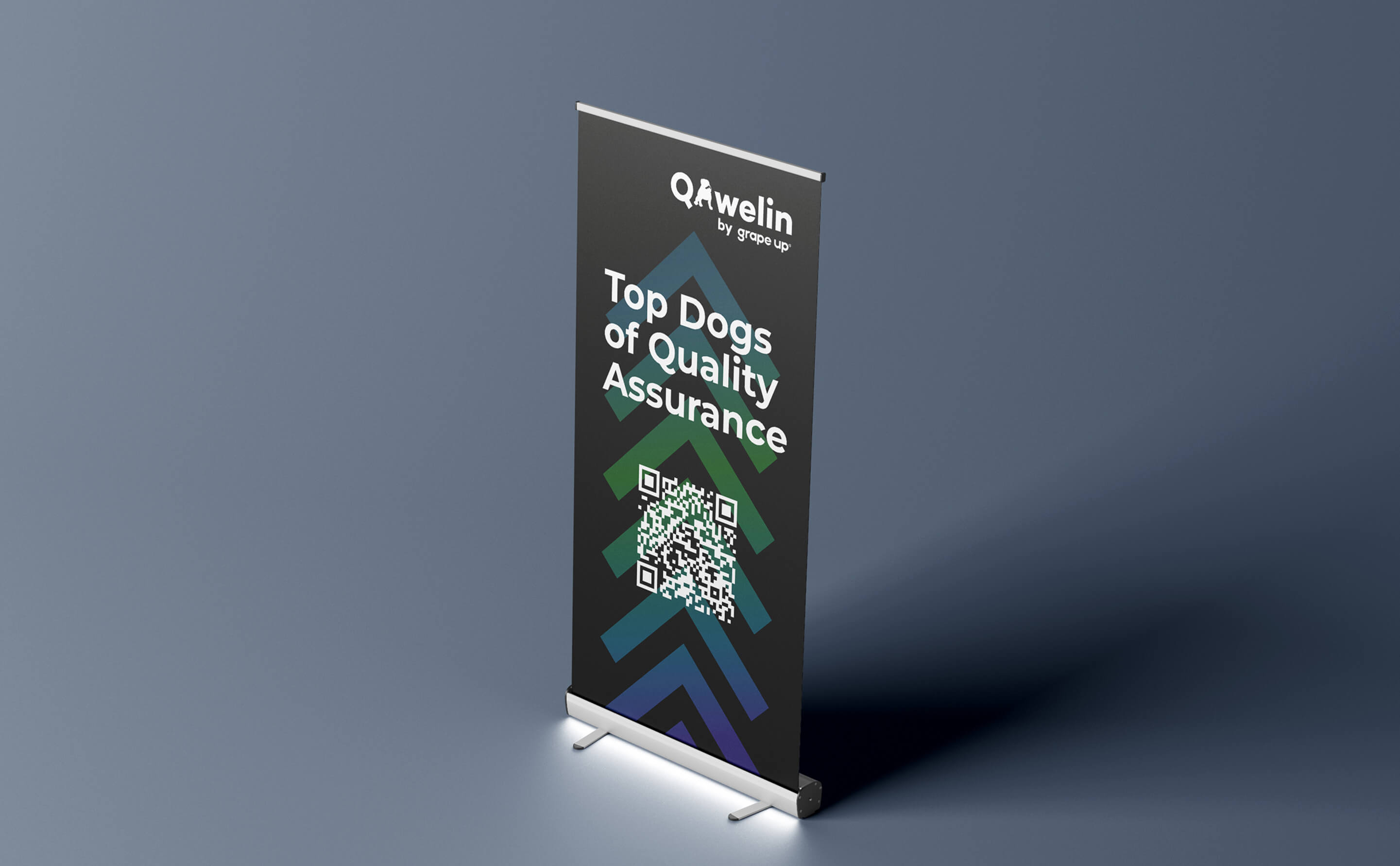
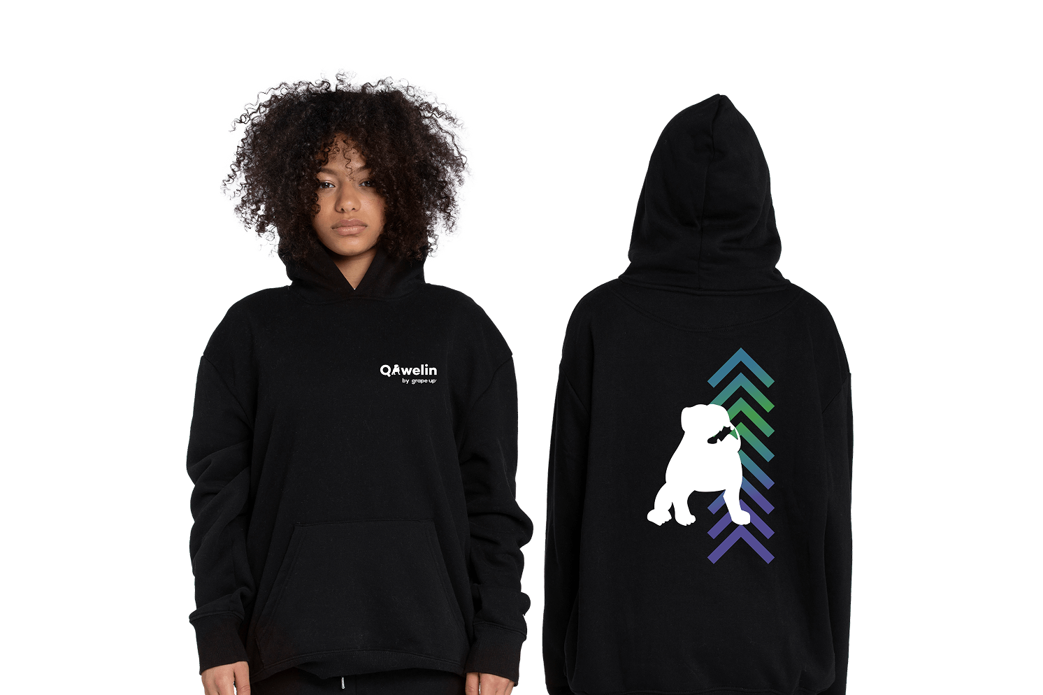
The new branding has given QAwelin a cohesive and memorable identity, enhancing its visibility and strengthening engagement within the tech community. The locally inspired graphic mark - the dog’s jaw - serves as more than just a visual element; it has become a symbol of community and a familiar point of connection for attendees. Designed with flexibility in mind, the identity is built to scale and evolve alongside the meetup as it continues to grow.