
Databoostr is a data-sharing platform from Grape Up, introduced in 2026 and built specifically for the EU Data Act. Manufacturers use it to pass the data their connected products generate to users and authorised third parties, with consent and an audit trail in place.
The product first appeared online as part of Grape Up's product portfolio, next to Cloudboostr. By then, its logo and colour palette had already come from my desk. As the product took shape, with packages and support of its own, sales and marketing needs pushed it to grow and stand apart. The brief was to give Databoostr a site of its own, and to make a platform with no history feel trustworthy from the first scroll.
The scope of work included a standalone website at databoostr.io, designed and built in Webflow, a design system in Figma, an explainer animation in After Effects, and a kit of social ad templates.



The first thing a new platform has to sell is the sense that it's ready.
A name the market didn't know yet. Databoostr already had real client deployments behind it, but on its own, as a brand, it wasn't yet recognisable. It answered a market need that came with a fixed date, so the site had to earn trust from the first scroll.
A home of its own, the same family. Moving out of grapeup.com, Databoostr had to stand on its own, while still speaking the same visual language as Grape Up and its other products.A deadline set by the market. The launch was set by market need and by the EU Data Act deadline: five weeks from site map to launch.


Mark and colour
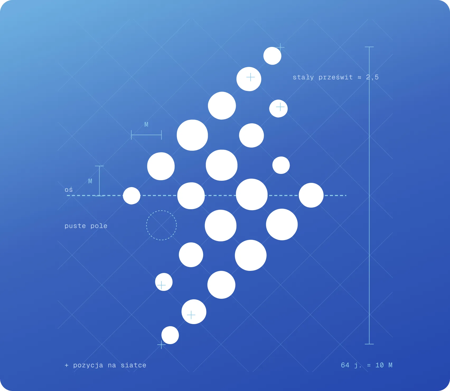
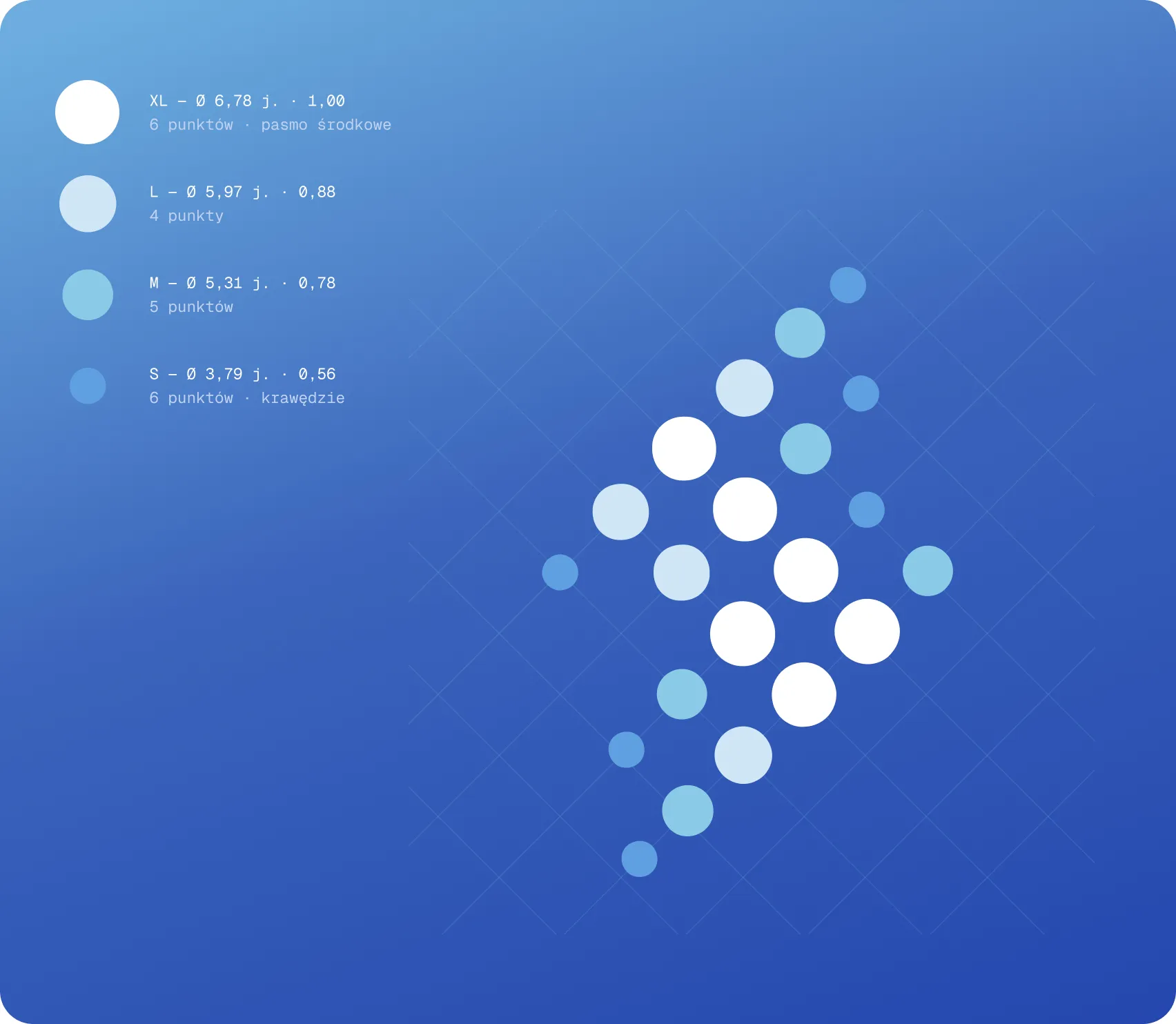
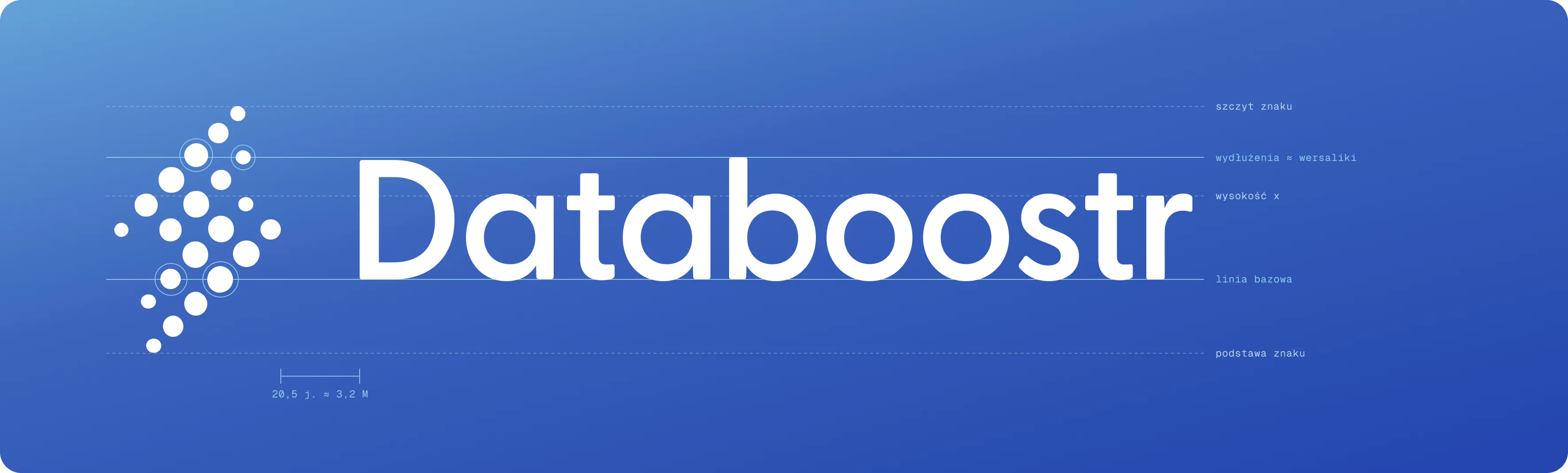
Grape Up names its products alike and marks them alike: dots for data, one gradient each. For Databoostr the dots fall into a lightning bolt. It's a nod to the boost in the name, and to what the platform does: data moving fast and in one direction, from where it's generated to where it's needed. A lightning bolt is instantly read as energy and speed. Built from separate dots, it shows that here, the charge is made of data.
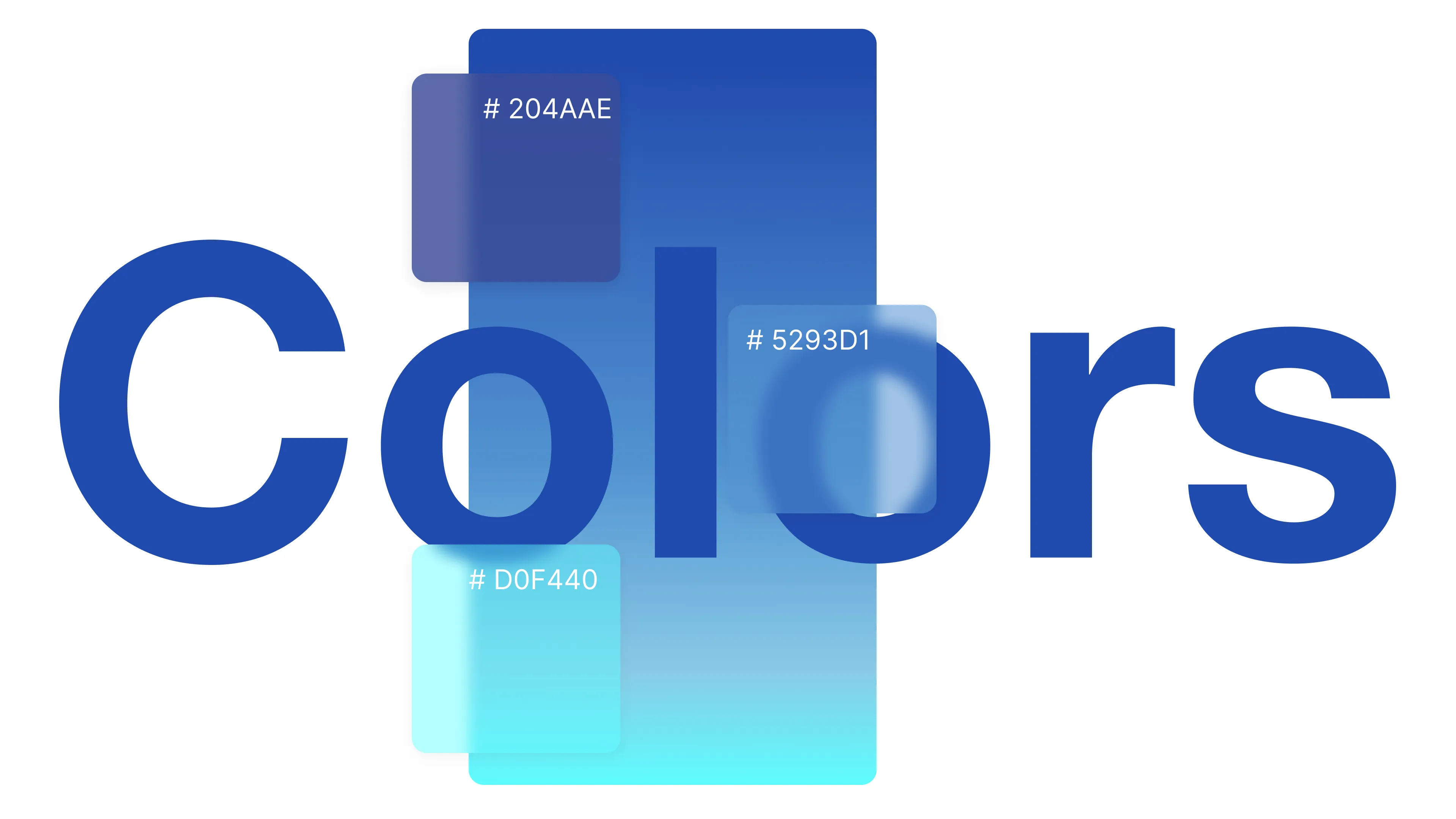
Its colour is blue, running from #5596D1 to #2652B4. In tech, blue is the colour of trust: the shade of cloud platforms, banking and enterprise software, long associated with reliability and security. For a platform that handles other companies' data, under a name the market didn't know yet, that association does part of the work before a word is read. Calm and technical, it also sets Databoostr clearly apart from its siblings' green and violet.
The site
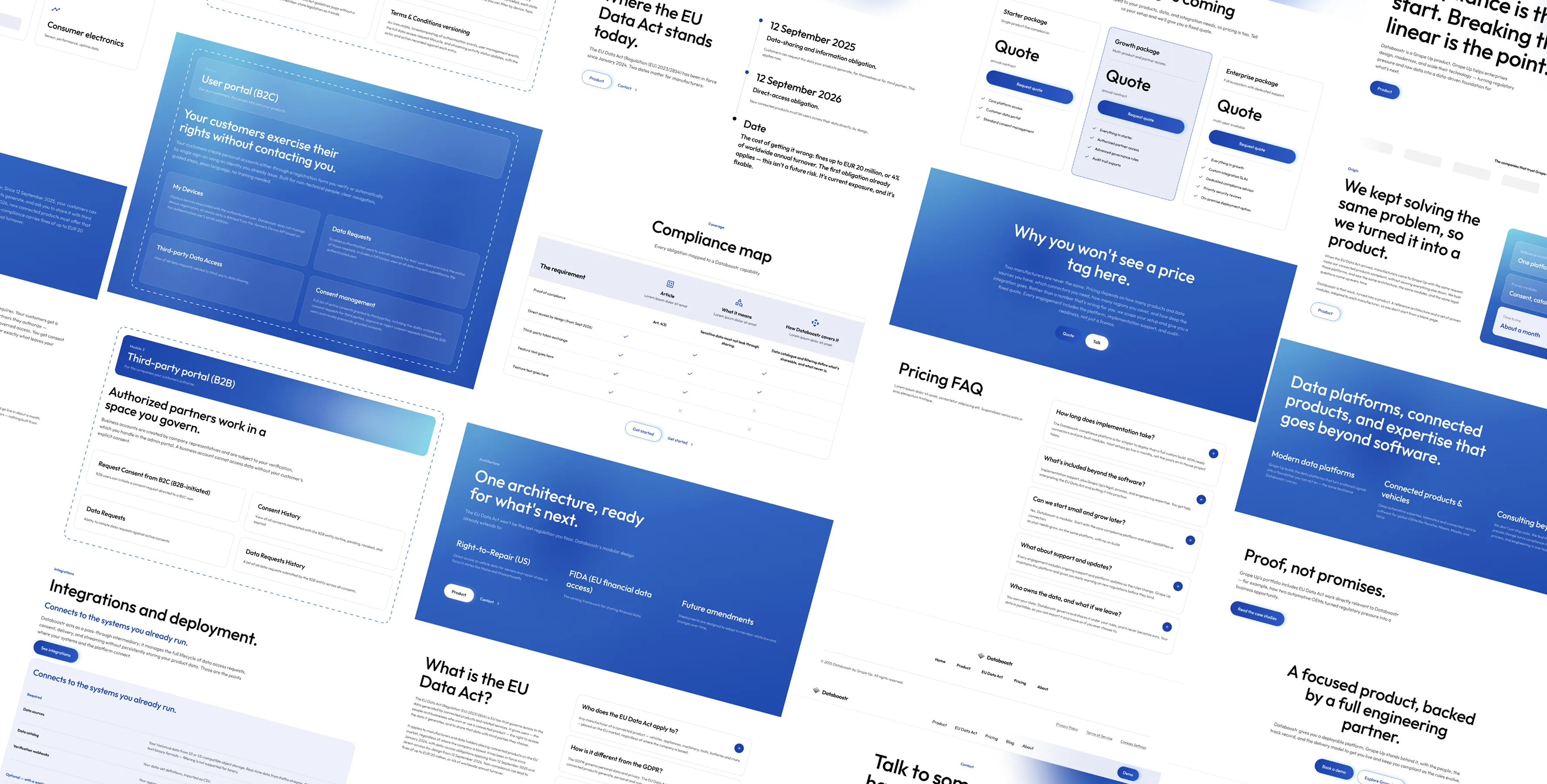
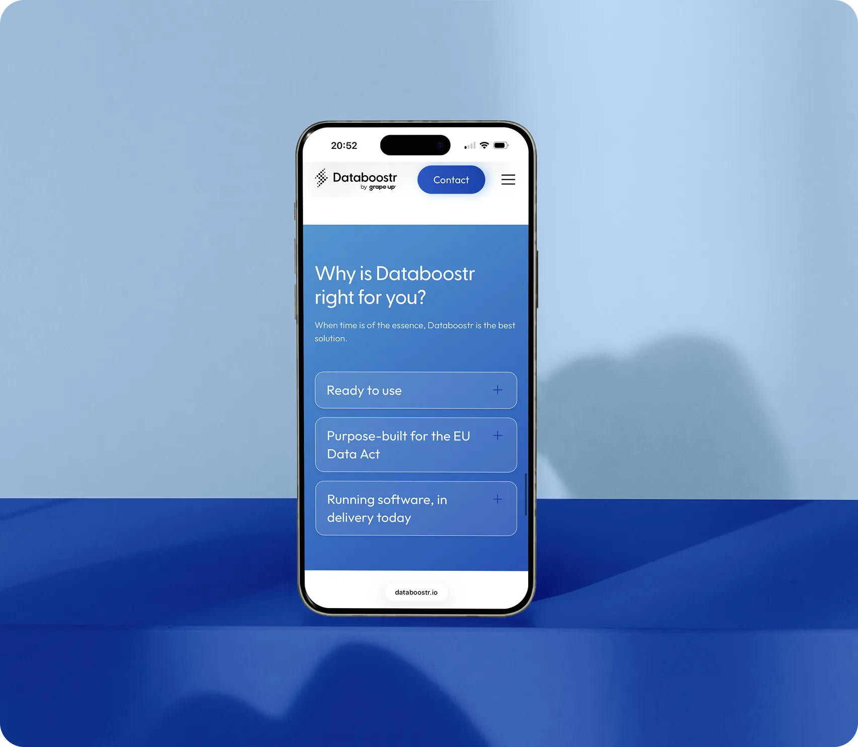
The pages move in two rhythms. White sections carry the detail and keep a family resemblance to Grape Up. Full-bleed fields of blue, set in white type, interrupt them where the argument peaks. Headlines are in Greycliff CF, body copy in Outfit.There is no illustration of “data” here. The imagery is the product itself, a dashboard and a consent table among them, so the platform introduces itself by being seen at work. Colour is left to do the distinguishing.
The data in motion
Some things are easier to watch than to read. A short After Effects sequence traces the path of the data: out of products in manufacturing, home appliances, vehicles and energy, through the manufacturer and into Databoostr, where it is catalogued, filtered, cleared for consent, secured and logged, and on to users and third parties.
The build
The site is built in Webflow and named in Client-First. Part of the sections start from Relume components, adapted to the brand, while the rest are custom-built where the content asked for something of its own. That mix let the site be assembled quickly and extended safely. Marketing now edits copy, publishes through the CMS and adds sections on its own.The smallest element took the most persuasion. HubSpot's form arrives with styling of its own. To make it belong, I addressed its elements by ID and overrode the defaults in custom code, developed with Claude.


Campaigns
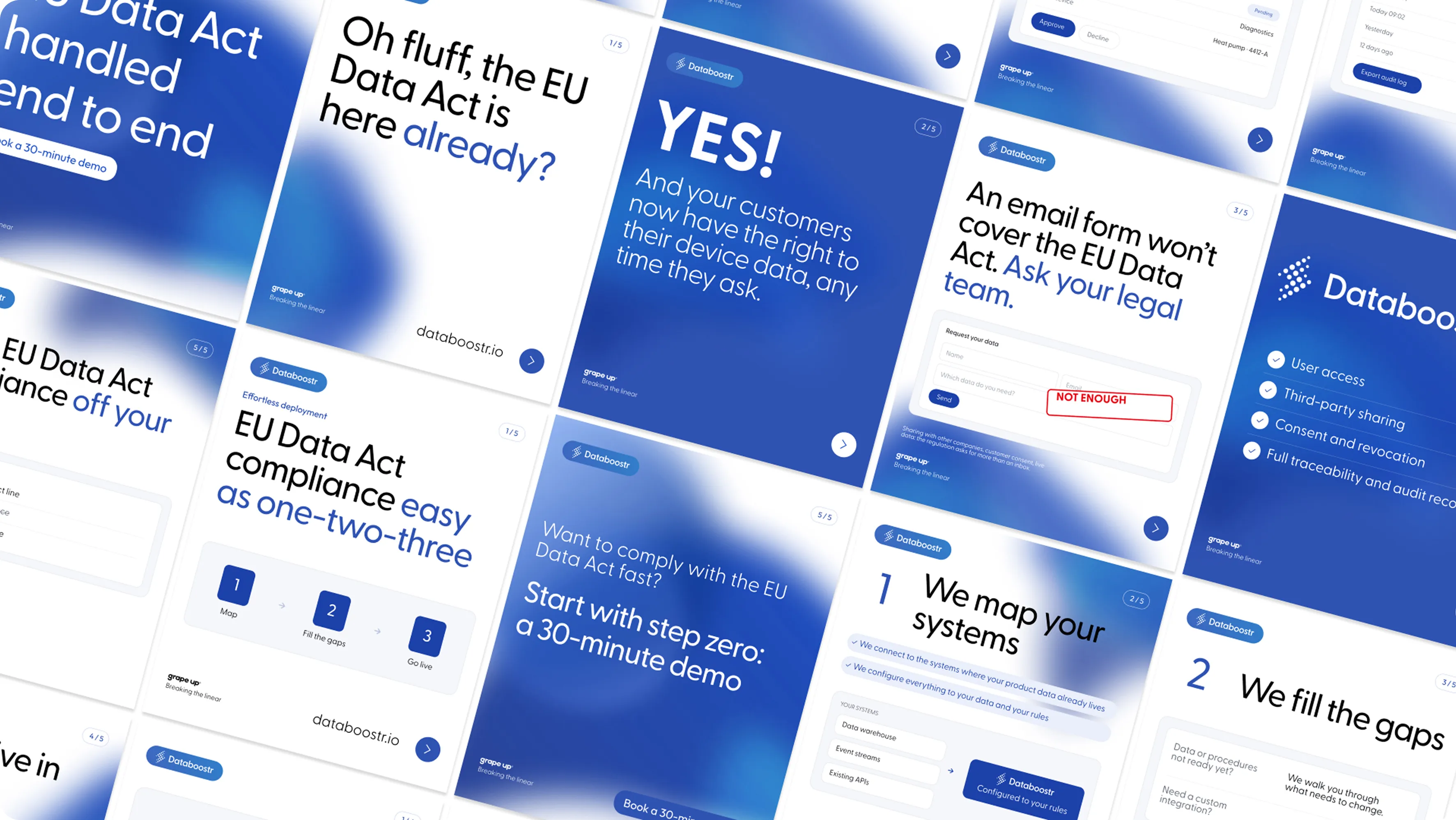
CampaignsDataboostr reaches its audience through Grape Up's own social channels and through paid ads on LinkedIn and Facebook. Both needed a steady flow of new materials, so instead of designing single posts, I built a scalable system for them.
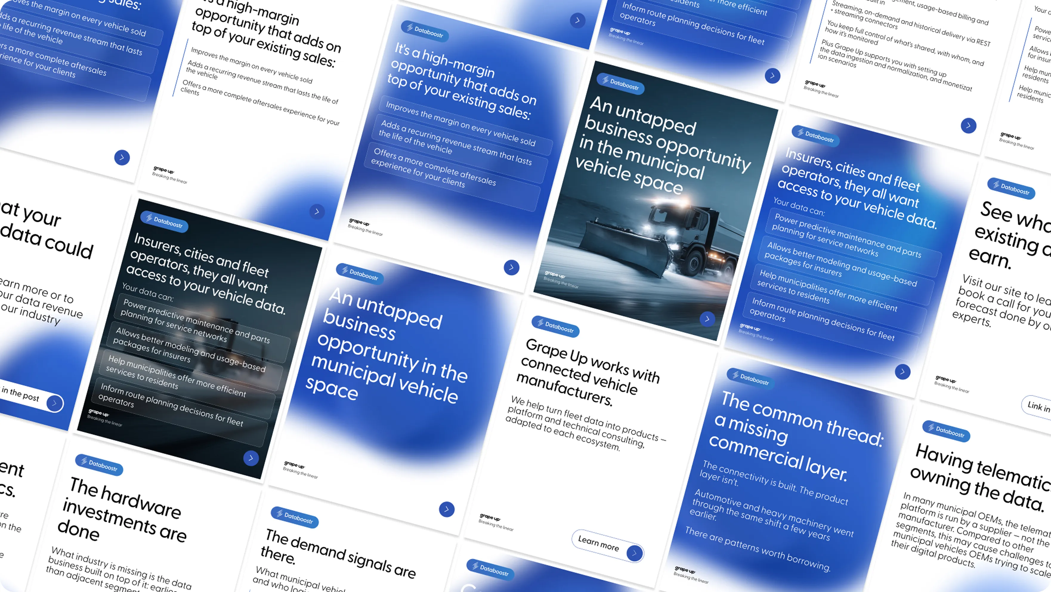
The kit of about ten templates covers the formats each channel asks for, from square posts to vertical ads. Every template is made of the same parts: a grid, a type scale, a place for the product's screens and a place for the message. Swapping the copy or an image doesn't break the layout, so new materials can be produced quickly and stay consistent, whoever makes them.
The system grows out of Grape Up's own design. The templates share the company's product layout and grid, and are set in Greycliff CF, the same typeface as the site's headlines, so on a feed Databoostr reads as part of the same family as its siblings. Colour and a product label do the distinguishing.
Five weeks after the first site map, a platform nobody knew had a home that looked as if it had always been there. Databoostr launched with a brand that is clearly its own and clearly part of Grape Up, carried through the site, the explainer animation and the campaign kit. Built on a component system and a CMS, the site and its templates let marketing keep publishing, extending and advertising on their own.


