Apisense turns hives into sources of data. Sensors, acoustic, environmental and satellite readings, analysed by AI, let beekeepers see problems in a colony before they become visible, and help growers measure pollination before the harvest. The company calls it Biological Intelligence.
The website came in two stages. First, a landing page, designed and built against the clock to present the new version of the Apisense sensor before an industry event in Abu Dhabi. A month after it went live, work began on the full website: product pages for Bee Health Intelligence and Pollination Intelligence, a page for investors, a science blog, contact and legal pages.
The scope of work included a new visual language built around the existing logo (colour palette, typography and graphic motifs), the design of the landing page and the full website in Figma, and the build in Webflow, localised into English, Polish, German and Spanish. Copy came from Apisense's marketing team, and photography from the company's photographer.
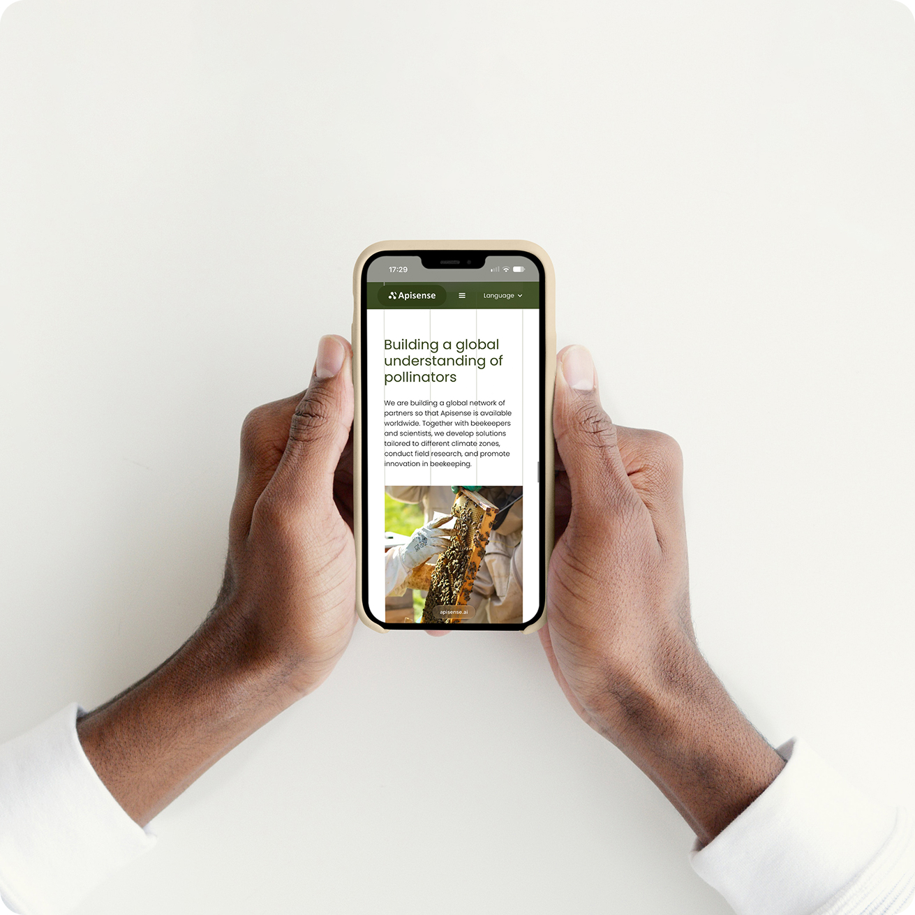
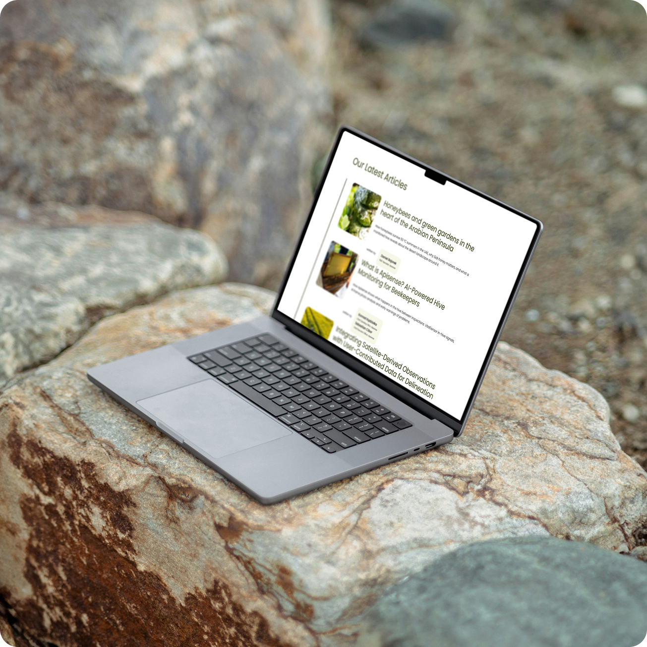
A product about nature, built on data, has to look like both.
A launch with a date. The new sensor had to be shown before the event in Abu Dhabi, so the landing page had to be designed and live first, and fast.
Two worlds, one page. Apisense sells something nobody can see: what happens inside a hive before a problem shows. Its story lives in the field, among bees, blossoms and beekeepers at work, but its value lies in sensors, AI and millions of processed signals. The site had to make that technology feel tangible and trustworthy, without losing sight of the nature it serves.
Many audiences, one story. That story had to reach very different people. A beekeeper wants to know how the sensor protects their colonies, a researcher looks for the science behind it, a partner for a business case, an investor for scale. Rather than splitting the site into separate worlds, the structure had to carry them all through one narrative, from the product's promise to the path that's theirs.One site, four languages. And it had to tell that story in four languages. Apisense works with beekeepers and partners in more than 40 countries, so every page had to read just as well in English, Polish, German and Spanish, with a layout that holds as the copy grows longer in one language and shorter in another.
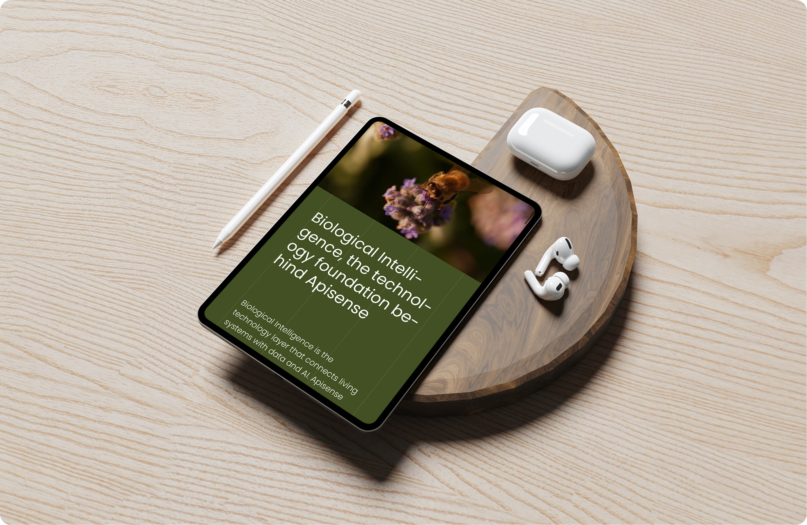
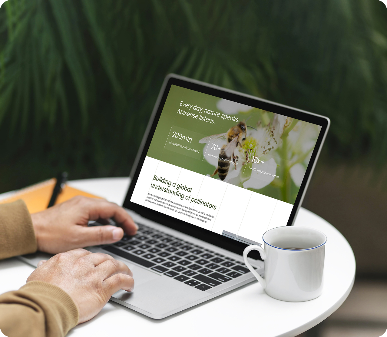

The project began with two design directions, each with its own colour palette: one built on a glass effect, the other on a grid. The grid won.
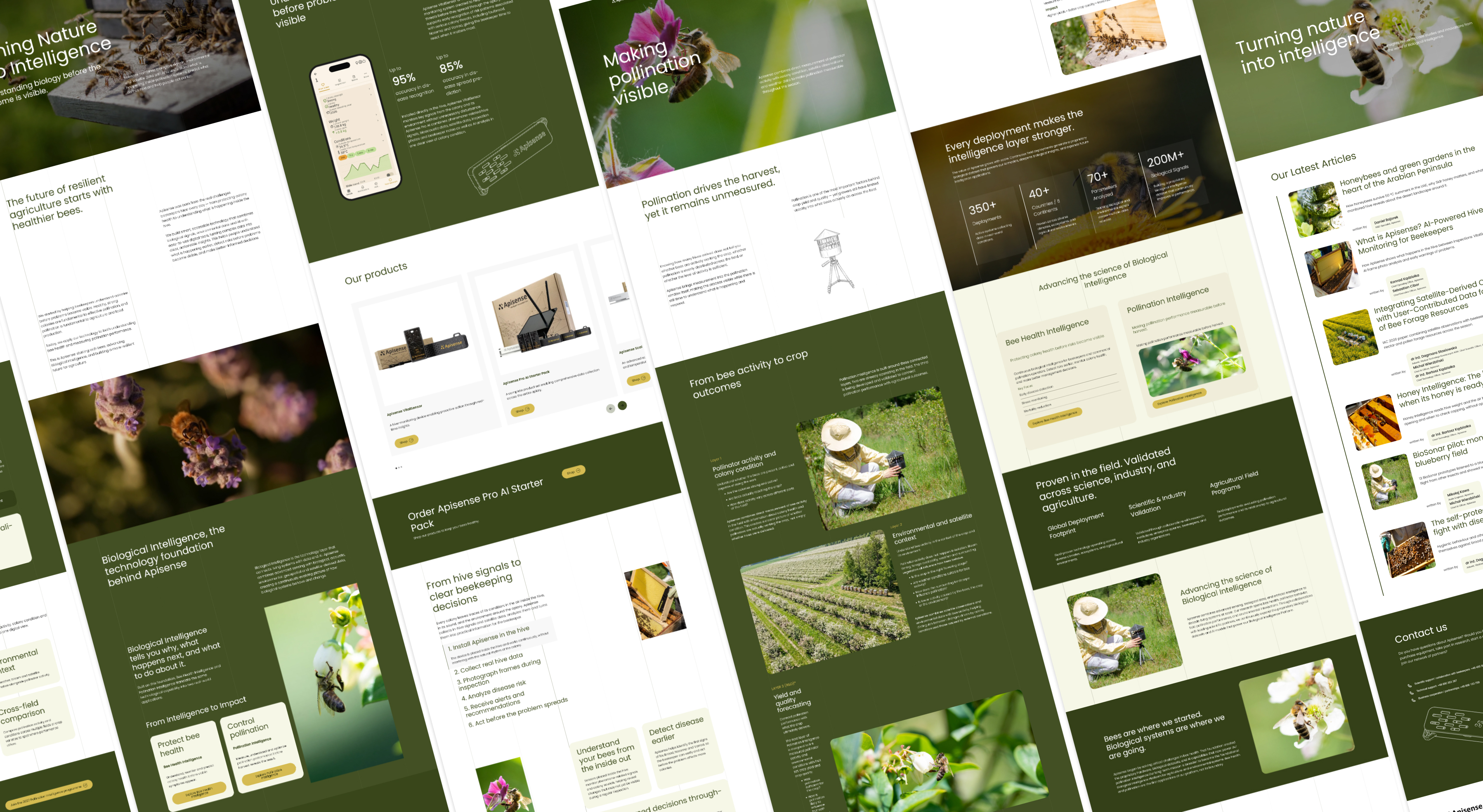
The grid grows out of the product itself. A technical drawing of the Apisense sensor appears across the site as a graphic motif, and its precise lines extend into a grid that runs through every page. It gives structure to content laid out asymmetrically, as the product's story unfolds section by section, and it adapts from desktop to mobile without losing its rhythm.
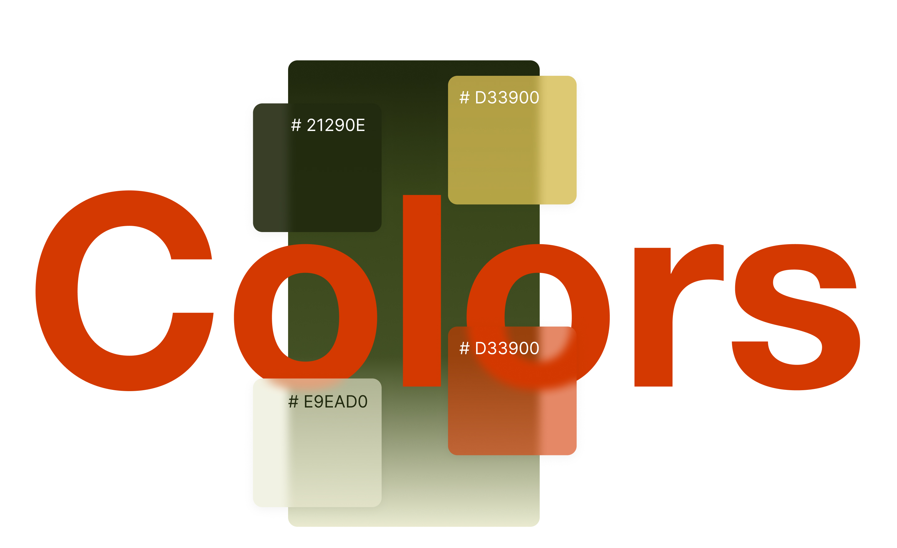
The palette takes its tones from the field and the hive. Three olive greens, from #425023 down to an almost-black #21290E, give the site its depth, while warm creams and off-whites (#F7F7F3, #E9EAD0, #F0EEDA) give the content room to breathe. Two accents are used sparingly: honey yellow #D5BB51 for warmth, and a sharp red-orange #D33900 reserved for calls to action, so the next step is always easy to find. The whole site is set in Poppins, a geometric typeface whose even, technical lines echo the precision of the sensor drawing. Together they keep the site calm and precise, closer to a research instrument than to a gadget.
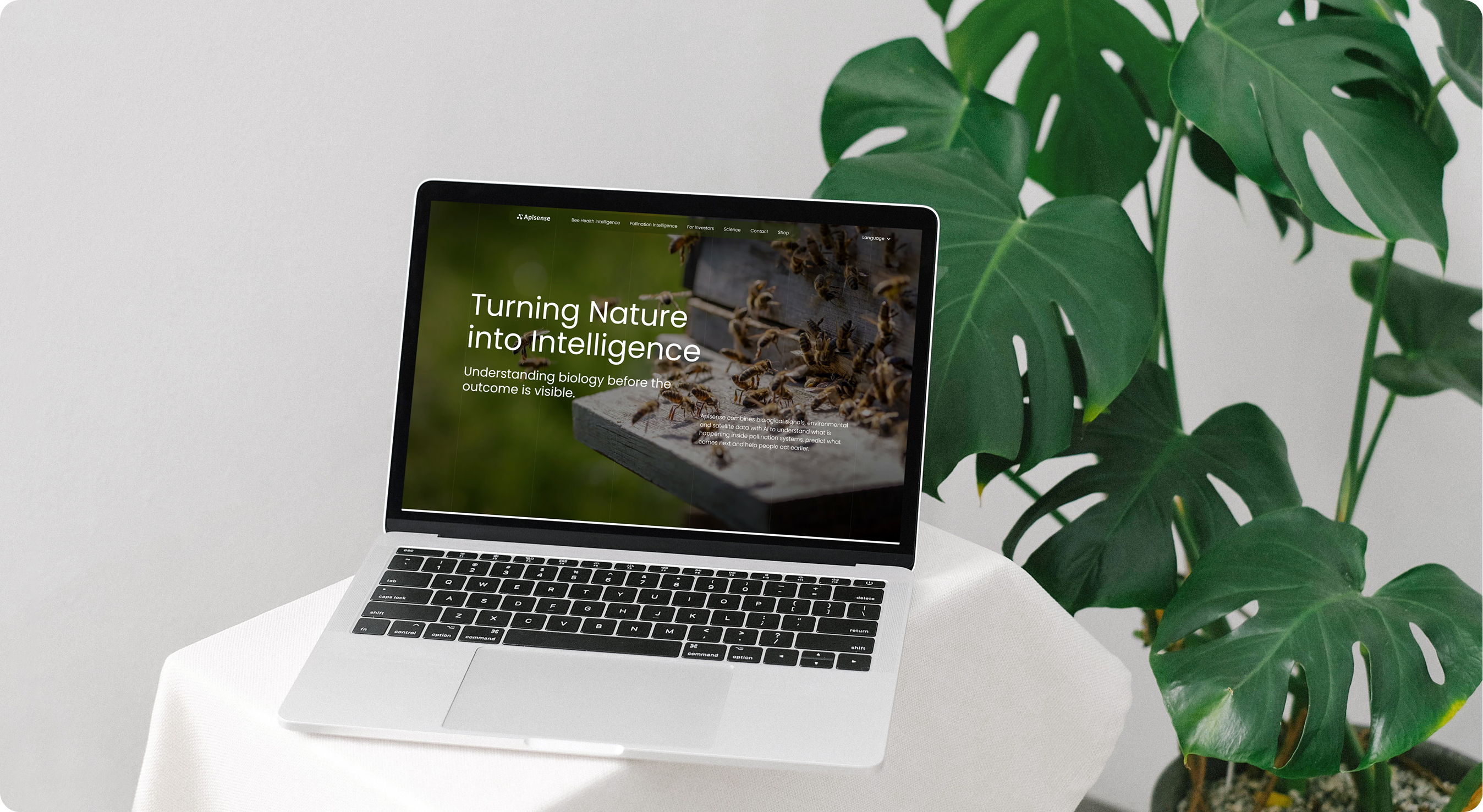
The photography stays close to the field: bees at the hive entrance, blossoms, beekeepers at work.
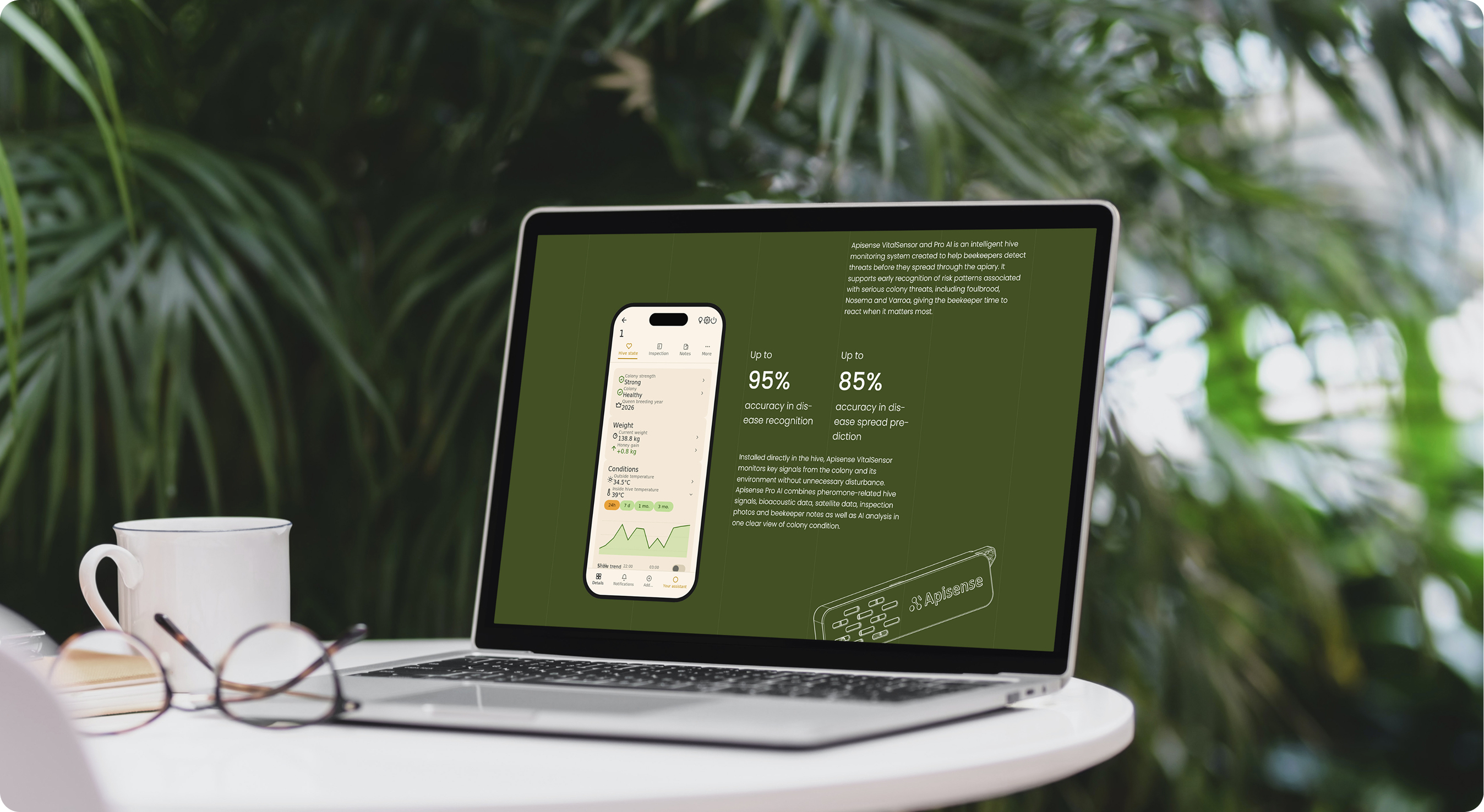
Numbers carry the other half of the story. Large figures for installations, countries and processed signals set the scale of the platform at a glance, and a five-step sequence leads from hive signals to clear beekeeping decisions.
The site is built in Webflow, named in Client-First and driven by Webflow Variables, so the grid, spacing and colour come from one source. Webflow Localize carries every page into four languages, and the science blog runs on the CMS, so the team can keep developing it on its own.
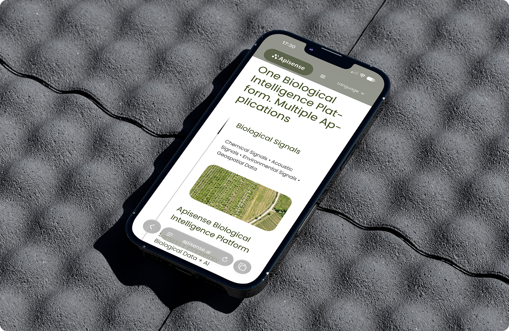
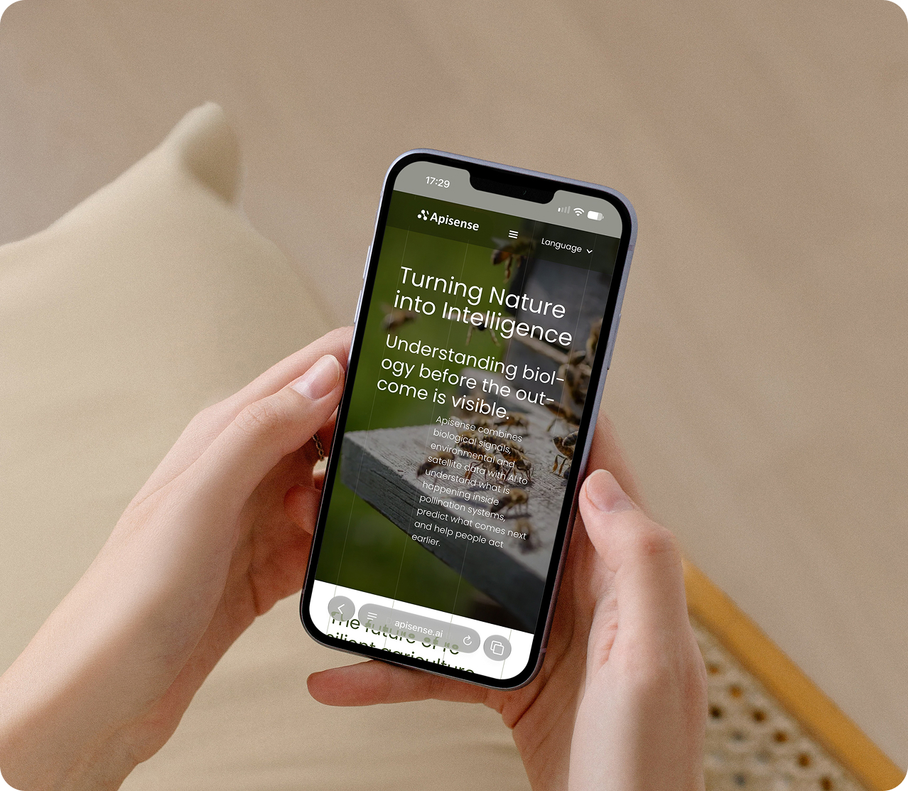
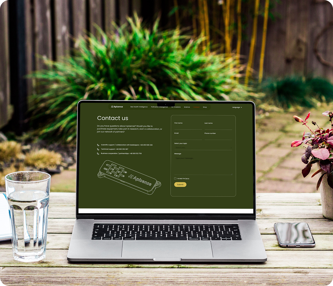
The final result was a website that effectively communicates GiQ's value proposition while providing an engaging user experience. The custom video player and cookie consent components demonstrate technical proficiency, while the overall design system ensures consistency and maintainability.